
5 powerful ways to visualize your data’s story

Data is all around us. Some of it is big and some of it small, regardless the size, the biggest challenge is not necessarily analyzing it, but sharing our findings. With 65% of the population identified as visual learners, it makes sense to display the data’s findings or story in a visual way. To help identify the best way to accomplish this, are following 5 powerful ways to share your data’s story visually.
- Visual Mapping
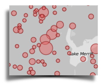
Visual mapping is an excellent method to display complex data sets. The visual map below visualizes the density of crime in Oakland, California. (www.polymaps.org) A suggested use for credit unions is visually mapping physical branch locations layered with member data with census data. Mapping this data can show branch usage by current and prospective member in terms of proximity, usage, demographic and income.
- Word clouds
Word clouds are a fantastic way to illustrate sentiment or weighted opinion that is gathered from surveys, social media or texts. Being able to clearly see what this data tells you is incredibly insightful. For example, the word cloud below is of the most commonly used passwords as gathered from a recent security breech data.

- Plotting
For data that is easily plotted on a chart, D3-js fee software that can manipulate the data in many beautiful ways. D3-js a JavaScript library for creating data-driven documents. It is exceptional at to help visualize data using HTML, SVG, and CSS.
- Heat maps
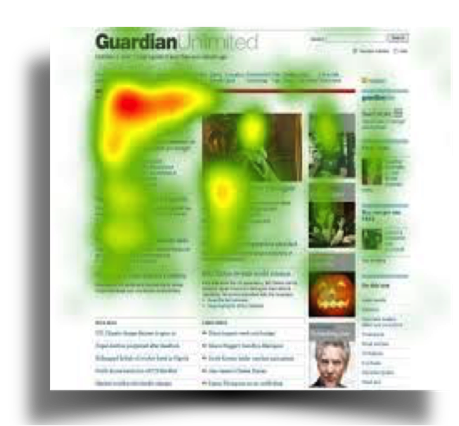
One of the cleanest ways to show behavior is via heat maps. These maps convert data points into color densities where red is the most dense aka “Hot“ and blue being the lest dense aka ”Cold”. These are widely used in retail to identify the traffic patterns and in website to see where visitors frequent the most. Below is a web page from the Guardian website (www.guardian.com)
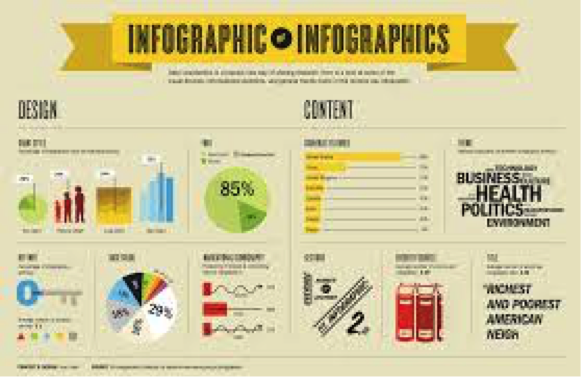
5. Infographics
The most commonly used tool to tell a data’s story is via an infographic. When creating successful infographics keep in mind three things. 1. Make it visually attractive. Use complementary colors, graphics and icons. 2. Present useful content. Illustrate time frames, stats and references. 3. Share the story/findings of the data. Display relationships, facts, findings and deductions.
Data storytelling is increasingly important, as businesses become more and more data rich. Finding the best way to share the insights from data is equally as important as findings from the data.