
A call to action to reduce credit union website calls to action

How many calls to action does your credit union’s homepage have?
If you don’t know, I encourage you to add them up.
Right now.
And for those needing guidance in this exercise, we’ve outlined a few steps for you to follow:
- Use Quirktools’ Screenfly to determine how many calls to action a user can see at a specific screen resolution.
- Set a custom screen size of 1366×768 as it is the most popular resolution used by consumers, according to W3 Schools.
- Count all calls to action, defined as any clickable banner, text link, promotional graphic or form, such as your online banking sign in. You can exclude items within drop down menus and navigation buttons from this calculation.
So how many calls to action did you find?
In one digital marketing study, we found the average bank or credit union has around 28 different calls to action on their homepage. We used a standard screen resolution of 1366×768, allowing us to fairly compare each website when calculating the various calls to action.
Without a point of reference, “28” may seem like an arbitrary number.
But think about it this way. Imagine if each of your physical branches had 28 different entrances. That’s what you’re essentially doing to your digital branch when you put so many different calls to action on your homepage.
In fact, as we continued our digital marketing study, we looked outside the industry at various online retailers who have simplified both their homepage and their calls to action.
Using the same methodology as before, we found that these homepages had an average of just 6.5 different calls to action. These highly focused websites were designed to help guide and lead consumers to take a very specific action.
An Exercise in Simplifying Consumer’s Choices
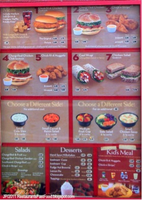
Sometimes simplifying the choices and options for a consumer requires you to focus and ultimately, say no to things. This is a key reason the Chick-fil-A menu only has seven choices. The fewer the choices, the easier it is for someone to make a decision on what to order.
Now compare the simplified menu to that of a crowded menu from other restaurants, like the Cheesecake Factory, where choice is abundant. Consumers have even compared this menu to reading a book:
“Always like the table bread, gives you something to munch on while waiting for your meal or just taking the time to read through the book that is the Cheesecake Factory menu.”
“The menu is a book, so if you’re indecisive like me look at it beforehand.”
“Their menu is HUGE, it’s like a small book. “
“Their menu reads like a book – just a little busy.”
How Can You Simplify Your Website?
Spend sometime reviewing your website from two perspectives: the consumer and the current member. When doing so, ask yourself:
- What can we remove from the homepage to simplify it? Copy? Images? Products?
- What can we remove from our product pages?
- What if we just offered three main products online? What would those be?
As you go through this exercise, it is important to test how consumers are using your website currently. This will provide you with perspective on their behavior, which can be compiled through heat maps, click maps and live feedback.
If you find you need help with any of these exercises, our Digital Marketing Blueprints can provide you with recommendations on how you can build a website that sells.