
Kiss your audience “Hello”
In this age of informative communication, we are recognizing the need to appeal to shortening attention spans. However, the amount of information we have to convey to members has not changed. This is the challenge—getting your message across, as clearly and concisely as possible.
Subsequently, that old saying “less is more” is more relevant than ever. Ogilvy was right—Keep It Simple, Stupid (KISS). And, nobody wants their time wasted with information that isn’t related to them.
What needs to change is the way in which we communicate. Consider your audience. You can always assume they have something better to be doing than reading your marketing materials, so, you have to tailor your content to their needs. Your audience needs the information, but they need it quick.
While there used to be newspapers, periodicals and magazines, we now have blogs, microsites and newsfeeds. Communication is still necessary to conduct business. The quality of content is still important, but the delivery can be even more critical. In today’s information superhighway, you have about 2 seconds to get someone’s attention. Once you get it, you’ve got to keep it.
What’s one way to do it? An infographic.
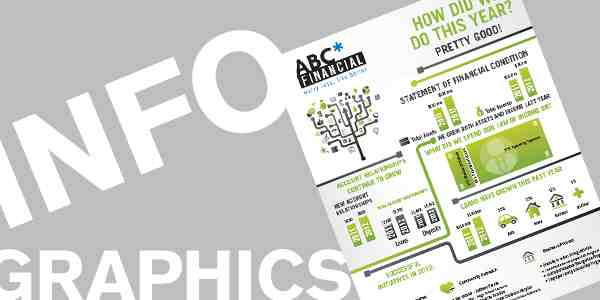
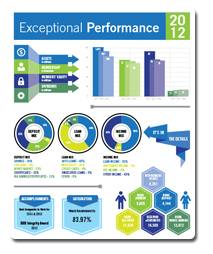 In the objective of communicating a large amount of information that involves statistics and comparative analysis, like in an annual report, we often pair words and numbers to create graphs as part of the layout. As we all know, doing this year after year can be tedious to create and boring to look at.
An infographic takes simplicity to a new level. Take what you have now, and pare it down even further. What is the absolute most important information that needs to be conveyed? Sure, we really want to include details about A, B, and C. But does your audience really care about anything other than C?
Then, after you know the bare minimum of your content, don’t just plug it into a pie or a bar graph. Research and experiment with more visually exciting ways to represent this information. What are you communicating, exactly? Is it conveying growth in green products? Considering using leaves, tree branches or other nature images as part of your graphic. Is there a certain sequential order in which events happened? Use a graphic that ties all the information together.
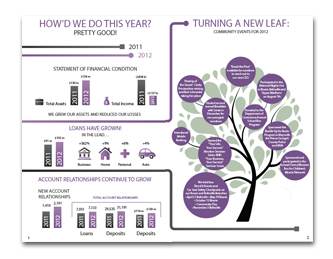 Depending on the delivery method of the infographic, the flow of the visual should correspond. For instance, an emailed infographic needs to be stacked so it is read in the correct sequence as the viewer scrolls down. If the infographic is done in print, you have either option of wanting your audience to read left to right or top to bottom. Whichever method, remember not to overwhelm with too many visuals and have breaks in between separate factoids.
Overall, designing infographics is an art. It’s not just pasting numbers on pictures. It’s giving meaning to graphics in a way that tells a story.
The more simple your marketing message is, the more likely your audience will keep listening. Infographics do just that. Give them what they need and you have a chance of fostering a longer relationship.