For many credit unions, the homepage is one of the most important pieces of digital real estate. It’s where members and potential members land first, and often where they form their first impression of what the institution values most. A homepage can either serve as a gateway that clearly guides people toward products, or it can act as a wall of information where visitors struggle to know where to go next.
That’s why Sidney Federal Credit Union (SidneyFCU) decided to test a simple but powerful idea: what happens if we make Free Checking the star of the homepage?
The answer, measured through a rigorous A/B test, was remarkable. By giving their Free Checking product greater exposure at the very top of their homepage through simple changes to their credit union web design, SidneyFCU increased clicks on the product by 418% with full statistical confidence.
But the real story here isn’t just about more clicks. It’s about the importance of focus, the psychology of decision-making online, and why A/B testing is such a critical tool for credit union growth.
Why Free Checking matters so much
A checking account is not just another product. For most financial institutions, the checking account is the anchor relationship. When members open a checking account, they’re far more likely to:
- Make the credit union their primary financial institution.
- Use additional products such as credit cards, loans, or savings accounts.
- Engage more often with online and mobile banking, creating a daily digital touchpoint.
In other words, checking accounts build long-term loyalty. SidneyFCU recognized this and wanted to grow membership not just by adding any new accounts, but by attracting primary members—people who would make SidneyFCU their everyday financial home.
That meant one thing: alter the credit union website design to make it easier for visitors to find and start the Free Checking application.
Identifying the problem
Before the test, SidneyFCU’s homepage wasn’t pulling its weight. Analytics showed that very few visitors were navigating from the homepage to the Free Checking product page.
- Navigation rate (homepage → product page): 0.3%
- In comparison, other credit union tests showed product navigation rates above 1%.
This meant that thousands of people were landing on the homepage but not moving forward into an account application funnel. Even though Free Checking was strategically important, it simply wasn’t visible enough.
The hypothesis
The hypothesis was simple:
If we give Free Checking more prominence on the homepage, more visitors will notice it, click through, and begin the application process.
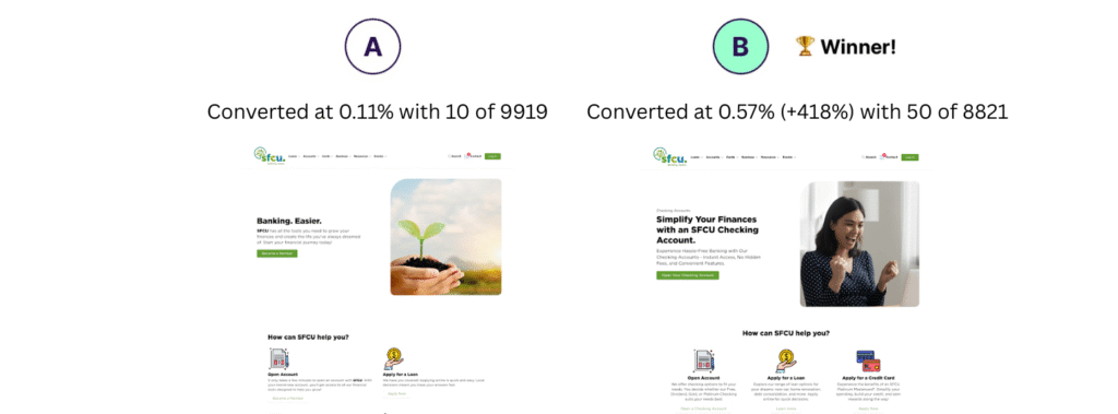
To test this, SidneyFCU created a variation of the homepage where Free Checking was highlighted in two key places:
- The hero section (the very top of the homepage).
- Below the fold (further down the page, to reinforce the message).
This doubled the exposure and made it unmistakably clear that Free Checking was a priority product.
The reasoning here comes straight from behavioral psychology. Online, people are flooded with choices. If everything is presented equally, the brain often defaults to doing nothing. But when one option is clearly highlighted, it reduces cognitive load and makes the next step obvious.
Why A/B testing was essential
It’s tempting for organizations to assume that changes like this will work. But assumptions are risky. In fact, in our experience running hundreds of credit union website tests, some changes that seem like “no-brainers” actually reduce conversions.
That’s why SidneyFCU didn’t just roll out the new homepage design blindly. They put it to the test:
- Control: Original homepage (no strong emphasis on Free Checking).
- Variation: New homepage (Free Checking emphasized in hero and below the fold).
- Visitors were randomly assigned to one of the two versions.
This experiment design ensured that the results weren’t influenced by outside factors, such as seasonality or marketing campaigns. Instead, it measured the real impact of the homepage change.
The results
The results were clear and statistically undeniable:
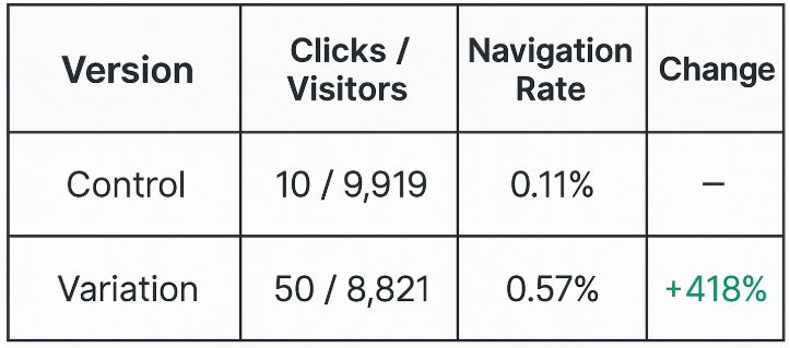
Impact: Visitors to the new homepage were more than five times more likely to click through to the Free Checking product page.
- Statistical confidence: 100%.
This wasn’t a marginal gain. It was a transformative change that reshaped how members and prospects interacted with the website.
Why this matters
The significance of this result goes beyond the homepage. It illustrates several important truths about credit union website design:
1. Focus beats clutter
A homepage can try to be everything to everyone, but that often leads to nothing standing out. By choosing one focus product and giving it prime placement, SidneyFCU was able to channel visitor attention toward a clear, valuable action.
2. Small changes can yield massive results
This wasn’t a full website overhaul. It was a single design adjustment: highlight one product more clearly. Yet it produced a 418% increase. That shows how powerful even modest design decisions can be when they’re aligned with strategic goals.
3. Data builds confidence
Leadership teams are often hesitant to make bold website changes because of the risk. A/B testing removes that fear. SidneyFCU didn’t just hope their new homepage would work—they proved it, with data, before rolling it out widely.
4. Member growth is tied to digital clarity
For many potential members, the website is the first and only interaction before deciding to apply. A homepage that doesn’t clearly guide visitors toward strategic products leaves opportunity on the table.
Broader implications for credit unions
This experiment also offers lessons for other credit unions:
- Make strategic products visible. If your growth goal is deposits, loans, or credit cards, feature those products prominently where visitors can’t miss them.
- Don’t bury your best offers. If checking accounts drive long-term relationships, they deserve top billing on the homepage.
- Reinforce the message. Place the call-to-action in multiple locations (hero, below the fold, footer) to catch different browsing behaviors.
- Always validate with testing. What worked for SidneyFCU might not work the same way for your audience. The key is to test your own design changes instead of guessing.
Conclusion
By emphasizing Free Checking on its homepage, SidneyFCU increased product navigation clicks by 418% with full confidence in the result. This wasn’t just a design win—it was a business win, directly tied to the credit union’s goal of attracting more primary members.
The larger lesson is clear: A/B testing turns website design from guesswork into a proven growth strategy. Instead of debating opinions about what might work, credit unions can use real data to guide decisions.
When members can see the right product at the right time, engagement rises, conversions follow, and growth accelerates. SidneyFCU’s success shows that credit union website design, when guided by testing, can transform a homepage from a digital brochure into a powerful engine for membership growth.
Curious how this would look on your site? Reach out to dk@metrifi.com for more information.