
How PeopleDrivenCU.org used growth-driven design to quadruple leads for loans
Meet Dave Sullivan, VP of Marketing at People Driven Credit Union (PDCU).

PDCU is a full-service financial institution that has been helping members and their families since 1928 and currently serves 25,000 members. Like many credit unions, PDCU has an aging membership and needs to attract younger people. If they don’t grow, they’re at risk of eventually merging out of existence, as has happened to 18,000 credit unions already.
My company, BloomCU, helped Dave with his credit union website design (peopledrivencu.org) and we continue to help him use it to win business. While there are many pieces to the puzzle when it comes to growing a credit union, his website plays a key role because, like most credit unions, it’s his most visited branch. Plus, young people are more likely to interact with his website than to call or visit a physical branch.
So, Dave and I have been working to use peopledrivencu.org to get more loans and deposits for his credit union. We practice The Growth-Driven Method of website design, which is a proven strategy to grow a credit union through continuous, results-driven improvements.
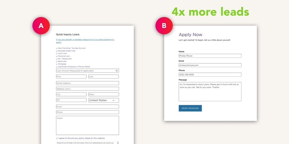
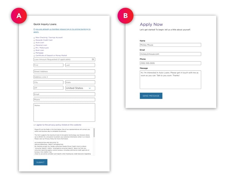
In keeping with this method, Dave and I brainstormed some ideas, looking for ways to generate more leads for loans and accounts. Then, we ranked our ideas, and one rose to the top of our list: Try simplifying his lead capture form, as the existing one was a bit too long and cumbersome.
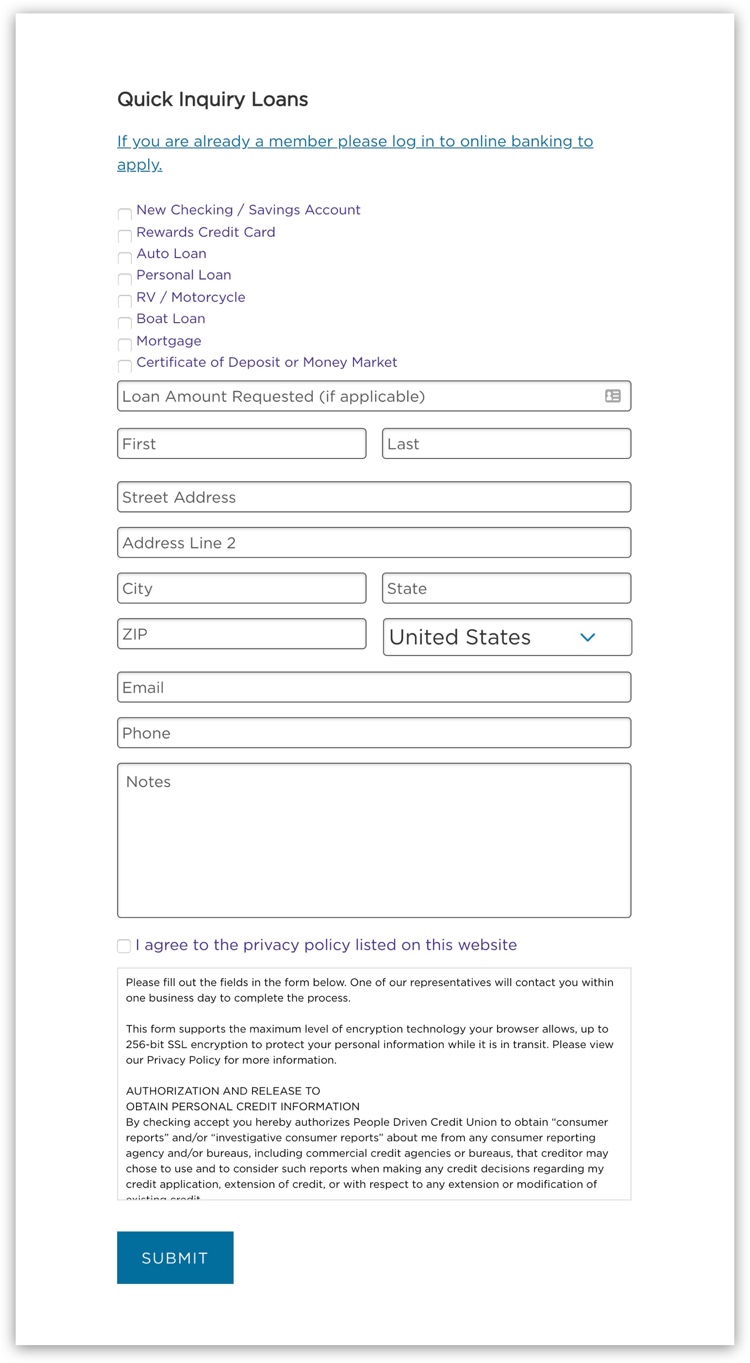
The existing form was a bit too long and cumbersome.
We believed we could make the form easier for people to complete and thereby generate more leads. To simplify the form and increase submissions, we decided to apply five data-backed insights:
- Use fewer form fields
- Include labels above form fields
- Show form fields progressively
- Implement an auto-populating message
- Don’t use “submit” for button text
(We also decided to make the introduction to the form a bit more in line with the user experience. While we didn’t have any specific research to support that decision, our intuition told us it was a good idea.)
With these insights in mind, we went to work to create the new form. We wrote a new introduction, reduced the number of form fields from 14 to 4, added labels, made the fields show progressively as they are filled out, and auto-populated a message for the user to send. We also changed the CTA button text from “Submit” to “Send Message” and, lastly, we decided to remove the privacy policy.
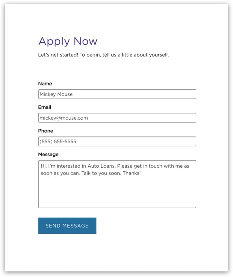
The simpler form had a new introduction, fewer fields, top-aligned labels, progressive fields, an auto-populating message, no privacy policy, and new button text.
Then we put the new, simpler form on trial by A/B testing it against the original, longer form. We ran the A/B test on a couple of Dave’s loan pages and split visitors between the two versions of the form: about half of the visitors were shown the original form (version “A”) and the other half saw the new one (version “B”).
We split tested the forms: half of the website users saw version “A” (the original form) and the other half were shown version “B” (the new form).
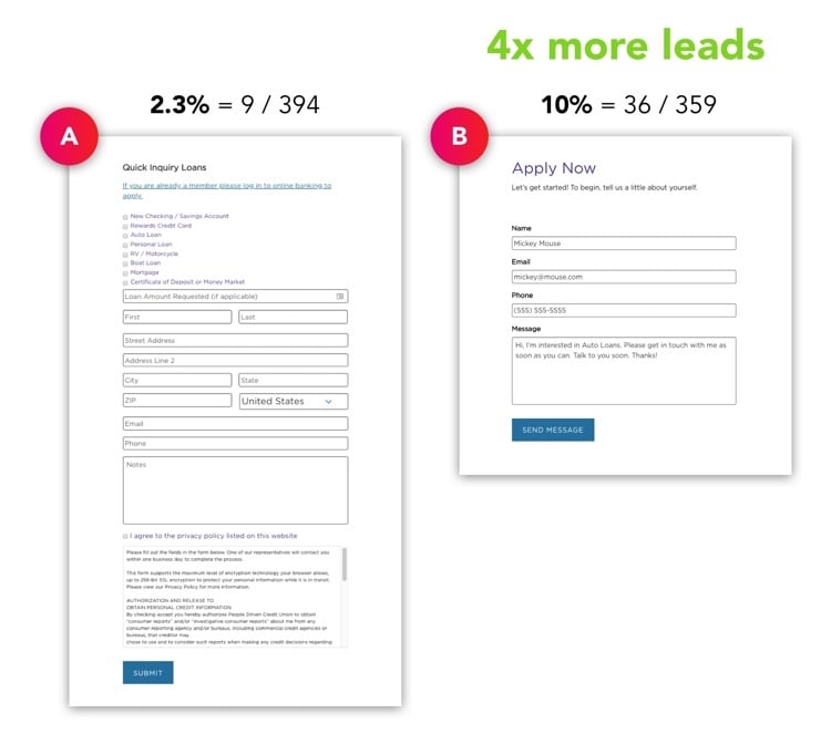
We let the A/B test run until we had 753 visits from peopledrivencu.org’s users and statistically significant results (the test reached 99.4% statistical confidence, which means you can trust the results because you want to see 95% or higher):
Version A (original form):
2.3% conversion rate (9 submissions / 394 visits)
Version B (New Form):
10% conversion rate (36 submissions / 359 visits)
The new, simpler form generated 4x more leads for loans. It’s 335% better at getting submissions than the original form.
“The new, simpler form generated 4x more leads for loans.”
This Growth-Driven experiment involved fairly simple changes to the credit union website design. It was easy to implement but produced big results. Now, using the simpler form, Dave is generating more leads from his advertisements to help PDCU grow.
Takeaways:
- Make your lead capture forms easy for visitors to fill out and you’ll get more leads. It’s a simple insight you can apply today to produce big wins and grow your credit union.
- Be a marketing scientist. Always test your ideas and measure the results. Don’t just assume an idea is good.
- Use The Growth-Driven Method to improve your website continuously.
Also check out this Case Study with HFSFCU.org that shows personalization increases user engagement by 31%.