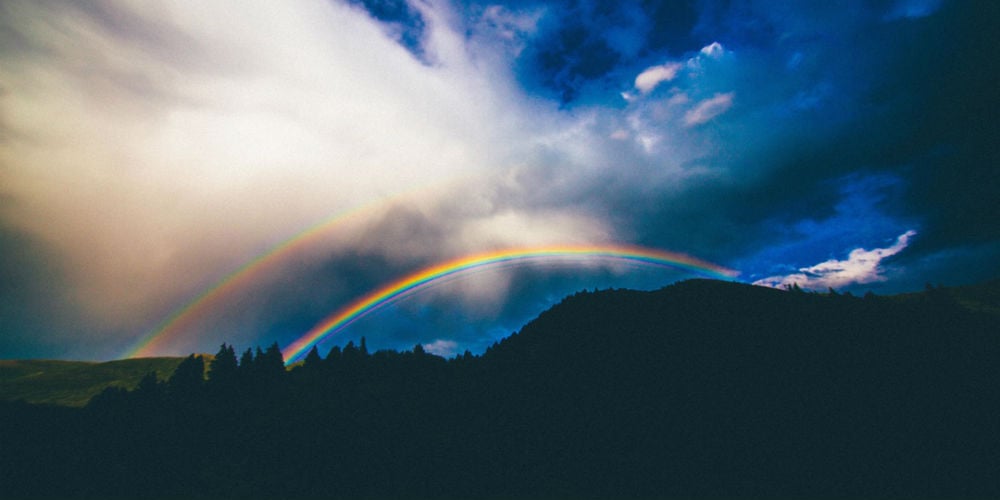
Our world is awash with color. In a single day, we see thousands of different hues that our brains interpret as robin’s egg blue, fuchsia, or olive drab, to name a few. Nature employs color with unparalleled artistry, making sunsets more breathtaking, flowers more exquisite, and wildlife more captivating. Though few compare with Mother Nature, designers also use color in a meaningful, emotive way. Whether it’s an interior designer choosing a color palette for a new restaurant, a graphic designer crafting a brand for a new company, or a product designer finding the most desirable color for his new product, a tremendous amount of care and thought goes into the selection of every color.
The Emotion and Meaning of Colors
Picture your favorite color. Is it a calming green? A vibrant yellow? Classic black? How does seeing that color make you feel? We don’t always realize it, but color is closely tied to human emotion. Even our language reflects this. We are “tickled pink”, “seeing red”, or “feeling blue.”
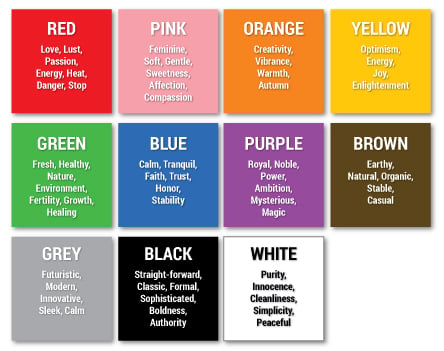
To Americans, the colors below typically represent the following emotions or characteristics:
Industry Color Connotations
Colors can also have a positive or negative association within a specific industry.
- Because being “in the red” is a negative financial term, most banks avoid using the color red in their brand and marketing materials.
- Young children prefer bright colors, so toy manufacturers steer clear of grays and subdued shades in their packaging to make the items more appealing to children browsing the toy aisles.
- Studies have shown that the color yellow can increase the severity of nausea; therefore airlines avoid using the color on the interior of commercial airliners.
- Drug company studies have shown that the color of a pill affects a patient’s feelings about taking the drug. For example, patients with acid reflux are more reluctant to take medication that is bright green, a color most people associate with acidity and sourness, preferring a soothing pink pill.1
Color Trends
First, you see it on fashion models in New York City, Paris, and Milan. The alluring purple of a fresh orchid. Soon, you notice it popping up everywhere – on linens and dishes at Target, as a popular new paint at Sherwin Williams, as a background color on TV commercials.
How does this happen? Color trends. Who makes it happen? Color trendsetters.
One of the most prominent color trendsetters in the world is a company called Pantone. Pantone was founded in 1963 to create “an innovative system for identifying, matching, and communicating colors to solve the problems associated with producing accurate color matches in the graphic arts community.”2 Since then, Pantone has expanded its color matching system into every other color-intensive industry including fashion, interior design, architecture, product design, and more. Pantone’s profound expertise and research, coupled with their influence in a variety of industries, makes the company a world authority on color.
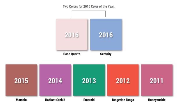
Pantone’s Color Institute® was formed to “study how color influences human thought processes, emotions and physical reactions, furthering its commitment to providing professionals with a greater understanding of color and help them utilize color more effectively.”3 Twice a year – in May and November – the Pantone Color Institute holds a closed-door meeting in Europe. The meeting attendees are a hand-selected group of individuals from a variety of industries.4 Their names are never revealed to the public. The walls of the meeting room are pure white to prevent any interference with the colors being viewed by the committee. By the end of the meeting, the committee has chosen the “Color of the Year”, a distinctive hue christened by the committee with a memorable name such as Tigerlily or Radiant Orchid. It doesn’t take long for designers to pick up the “Color of the Year” and start weaving it into their work, first in the fashion industry and then trickling down to everyone else. To view the Pantone Colors of the Year, visit www.pantone.com.
Finding the Right Colors for Your Brand
As a branding company, we see it far too often -- businesses selecting brand colors based on personal preferences, rather than through careful examination and strategy. Perhaps the CEO has an affinity for orange or the Marketing Director hates the color blue. By taking this route, you could be sending an inaccurate message to prospective customers every time you flash your brand, misrepresenting who you are and failing to reach your intended audience. Picture the Dodge Ram logo in hot pink. Does hot pink communicate ruggedness, the outdoors, diesel, and horsepower?
Take-Aways
- Color and emotion are closely tied. Understand the meaning behind every color before you choose colors for your brand.
- Consider your industry. Are there positives and negatives associated with specific colors?
- Color trends are set by color experts based on research and forecasted consumer preferences.
- Put personal preferences aside and select colors that effectively communicate who your company is, what you offer, and the benefit you provide your customers.
Contributing Author: Erin Ortiz
- Color Psychology in Medicine, Jill Morton, http://munsell.com/color-blog/color-psychology-medicine-jill-morton/
- About PANTONE, http://www.pantone.com/about-us?from=topNav
3. About PANTONE, Leatrice Eiseman, executive director of the Pantone Color Institute, http://www.pantone.com/about-us?from=topNav
4. The Business Of Color: Company Sets Fashion Trends, Ilya Marritz, http://www.npr.org/2011/02/10/133636541/the-business-of-color-company-sets-fashion-trends