
Why your credit union web design needs to keep the thumb in mind

In late 2015, mobile web traffic had just passed desktop for the very first time. Fast forward three years, and you can see this event was not just a significant milestone but also a very accurate foreshadowing for the world’s current state of mobile obsession. Up to 70% of web traffic takes place on mobile devices, and more people now own a cell phone than a toothbrush (we’re not sure how to feel about that…)
Mobile-friendly is the name of the game these days, and in order to come out on top, your mobile website needs to provide a seamless experience for visitors. The data proves that such an experience is expected by today’s user, as 57% say they won’t recommend a business with a poorly designed mobile site.
Optimize site navigation
So how do you make sure your credit union website design provides a positive experience for members? One of the most important features to consider is site navigation. If visitors can’t find the information they are looking for quickly and easily, they’re (a) not going to be pleased, and (b) not going to stick around for long.
Hence why you need to think about what makes for an intuitive navigation experience on a mobile device, as it’s very different from what works best on desktop. For instance, if you want happy mobile visitors, your navigation menu shouldn’t be at the top of the phone screen.
Make sure the thumb can reach
On a desktop computer, users can navigate their mouse all over the screen with easy wrist movements. Contrast that with mobile devices, where Steven Hoober found that 49% of people are using just one thumb to get things done. That means the thumb is now the mouse—and it doesn’t have quite the same range of motion. The thumb can’t even reach certain parts of the upper half of the screen, and the larger the phone, the harder it is to reach the top of the screen (and mobile devices only seem to be getting bigger).
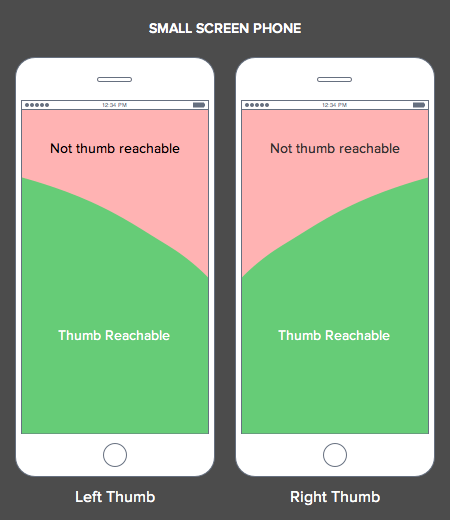
Thumb reachability, according to UXmovement
These limitations make it clear that your navigation menu needs to reside at the bottom of your credit union website design within easy reach of the thumb, even with a one-handed grip. The less the user has to move their thumb to get there, the better.
While many credit union mobile apps already implement this bottom navigation design, most mobile credit union websites are behind the times and unknowingly complicate the user experience.
But it doesn’t have to be that way. Here are examples of bottom navigation on mobile websites we’ve developed for two credit unions:
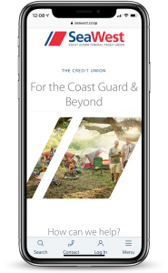
Mobile website developed for SeaWest.coop
Learn more about this website design.

Mobile website developed for PennEastFCU.org
Follow the laws of design
Fitts’ Law supports the need to accommodate the thumb. This law says that “the time required to move a pointer to a target decreases with shorter distances and larger targets,” which means the distance between a user’s pointer and interactive elements should be kept to a minimum. In other words, when designing your credit union’s mobile website, put interactive elements near the bottom of mobile screens to provide easy access for the thumbs.
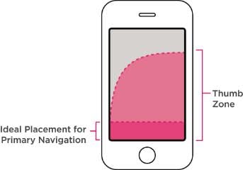
Ideal navigation placement, according to UXMag
As you’re building out the bottom navigation of your credit union website design, here are some additional tips to keep in mind:
- Try to have 3-5 buttons in your navigation menu. More than five makes navigation too complex and hard to tap.
- Don’t make the user scroll through a long list of navigation items.
- Make sure your navigation menu easily helps visitors to identify their current location within the site.
- Use icons to communicate actions on the navigation menu and make sure users can recognize the icons quickly. Also include short text labels to clarify your buttons.
- Make sure the icons are big enough to be easily tapped.
So design with the thumb in mind and your visitors will navigate your mobile credit union website with ease—we just wish we could also promise they’d have clean teeth while doing so…
For more tips on successful credit union website design, check out these award-winning insights.