Many credit union website designs use sliders on the homepage (aka rotating banner or carousel). In this article, I cite studies and make a case against sliders: the homepage of a credit union website design should never, ever include a slider.
Why do sliders exist?
You’re a credit union marketer and you’re in charge of the website. Your VP of Lending, CEO, IT Director, and HR Manager all want to promote something on the website. How can you possibly promote an auto loan, checking account, mobile banking security feature, and job opening all at the same time? Ah, a slider. Brilliant! With a slider, you can promote all four things on the homepage at once. Problem solved.
Or, in another case, maybe you’re just not sure which promotions your members are interested in. Instead of trying to guess what people care about, you can just put five promotions in the homepage slider. After all, people have different tastes; different people are bound to be interested in different promotions, right?
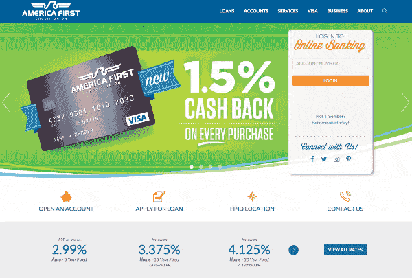
This is a slider on AmericaFirst.com. Notice that the slider is very distracting as you try to read the text of this article. Similarly, a slider can be distracting on a website.
From your perspective, there may be some really good reasons to incorporate a slider into your credit union website design, but what about the perspective of your members?
How do website users react to sliders?
Your credit union website was designed for one purpose and one purpose only: to cause action. You want people to mentally or physically do something as a result of visiting your website. The actions you desire include joining your credit union, getting an auto, opening an account, etc.
Just like you have a purpose for providing a website, visitors to your website also have some purpose. They come to your website because they have something in particular they want to accomplish. Never in my life have I visited a credit union website with no particular purpose in mind. You’ll have a hard time finding a single person who is on your website simply because he or she is bored and has nothing better to do than browse your site. People don’t browse credit union websites aimlessly. (In fact, I don’t believe people browse any website aimlessly; even when people waste hours on YouTube or Facebook, they are doing it for some purpose, even if that purpose is solely to seek entertainment.)
Action happens when your purpose aligns with a visitor’s purpose. For instance, if I come to your website to learn about saving for retirement and you make it easy for me to learn about IRAs and how to open an account, then we are on the same page; I might even open an IRA with you. On the other hand, if I come to learn about IRAs and you show me an auto loan promotion, the promotion is completely irrelevant: no matter how many times you show me an auto loan promo, I’m not going to buy a new car because of it.
Do sliders do a good job of aligning your purpose with the purposes of your visitors? If so, then people would interact with slides by clicking on them. Let’s look at some real case studies about sliders.
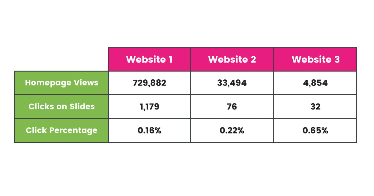
1. MWI
Marketing agency MWI shared some clickthrough statistics from three different websites that sport sliders on their homepages. Clickthrough rates on all three sliders were dismal, ranging from 0.16% to 0.65%.
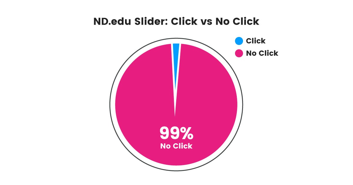
2. University of Notre Dame
Erik Runyon tracked clicks on ND.edu’s slider from mid-October 2012 to January 22, 2013. During that period, ND.edu’s homepage was viewed about 2.9 million times, and slides were clicked only 28,928 times, resulting in clickthrough rate of about 1%.
3. Beaconfire Red
Beaconfire Red tracked clickthrough rates on sliders from the websites of four different nonprofits. On these four different websites, clickthrough rates ranged from about 0.9% to 2.0%.
![]()
The slider of each website is represented by a different color.
There’s another insight to glean from the pretty little graph above: the first slide (Slide A) gets clicked way more than subsequent slides. This insight is true not only for all four sites tracked by Beaconfire Red, but true for every study I’ve seen that has slider click data. Here are a few studies with interaction rates for slides based on their positions in sliders:
- Study of ND.edu (University of Notre Dame)
- Study of york.ac.uk (University of York)
- Study of several mobile eCommerce sites from Mobify
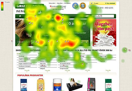
4. Grizzly Zoo
Mårten Angner tested a slider vs static content on Grizzly Zoo’s website. Just 2.06% of homepage views resulted in clicks on the slider, while the static content generated a click rate of 40.53%. Therefore, the static content is the obvious winner.
Marten also captured some very useful heatmap data to accompany his click data:
Slider Heatmap
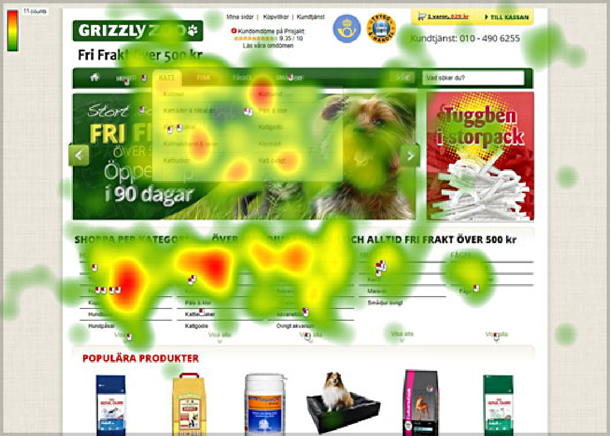
This is a heatmap of user interactions when the homepage used a slider. Users essentially skipped the slider and went straight the content beneath it. The red spots that appear to be on the slider image are actually from users interacting with a drop-down menu that covers up the slider image (look carefully and you’ll see the drop-down menu in the image).
Marten then replaced the slider with new static content. He says, “The new version was conversion optimized and had a static image with the possibility to choose your pet with buttons in the image.”
Static Content Heatmap
Compare the Static Content Heatmap with the Slider Heatmap and you can clearly see which option draws more attention and interaction from users.
What do we learn from these studies?
The studies above are just a sample of many publications that show sliders usually produce poor results. That’s why my credit union website design agency dissuades our clients from wanting sliders.
While the general consensus is that sliders are a bad idea, there are some cases in which sliders have been used successfully. Slider success stories are harder to find and harder to produce because success with sliders requires a more targeted audience and thorough A/B testing (not to mention special attention to search engine optimization practices to mitigate the negative impact sliders usually cause to SEO) .
The information above is enough for me to not use a slider on any website, but I would especially discourage the inclusion of a slider in a credit union website design. As mentioned
above, there are at least two requirements to make a slider successful, neither of which are good fits for credit union website design:
(1) Targeted Audience
For an organization that sells just one product, maybe a slider would be an acceptable way to show how people use that one product. However, credit unions are not one-product organizations. The people who see the homepage of your credit union website are interested in many different things: checking accounts, savings accounts, IRAs, personal loans, auto loans, mortgages, credit cards, etc. If you pick a combination of products and services to show in a slider on your homepage, chances are whatever you pick is going to be irrelevant to 97% of your audience (Chet Holmes, author of The Ultimate Sales Machine, writes that if you randomly pick a product, only 3% of your audience wants to buy it right now). A 3% chance of relevance is very poor. Plus, don’t forget what we learned above: most interactions are with the first slide and deeper slides get ignored (see Beaconfire Red cases above), assuming the slider isn’t ignored entirely (see Grizzly Zoo case above).
Instead of featuring content that gets ignored, a credit union website design should amplify the impact of the homepage. After all, the top of your homepage is your most trafficked and valuable website real estate. Below, we’ll talk about alternatives that better suit credit union website designs than sliders (see “What alternatives are better than sliders?” below).
(2) Thorough A/B Testing
In one case, Conversion Sciences produced a homepage slider that outperformed static content. They got that result through forming hypotheses and running A/B tests. Nevertheless, Conversion Sciences says that’s not a typical result: they typically get better results from using static content.
If you’re an A/B testing fanatic, then test your heart out: pit a slider against static content. But, can I be frank? Most credit union marketers are not A/B testing fanatics. In fact, most credit union marketers have no idea what clickthrough rates they get on homepage content of any kind. While I believe credit union marketers can and should be much more focused on data and results, that’s just not the case at this moment in time. Even if you do test a slider, you’ll probably get poor results. But if you are not going to run rigorous tests on a weekly or monthly basis, then definitely do not include a slider in your credit union website design.
Why don’t users interact with sliders?
Jakob Nielsen conducted a usability study for Siemens in the UK. At the time of the study, the homepage of Siemens used an auto-forwarding slider. Through observing a user of the site and asking follow-up questions, Nielsen concludes that the user completely ignored the content in the auto-forwarding slider. Why did the user ignore the slider?
Similarly, why did users ignore the Grizzly Zoo slider? The most likely answer is Banner Blindness. According to Wikipedia, “Banner blindness is a phenomenon in web usability where visitors to a website consciously or subconsciously ignore banner-like information.” Think back to the beginning of this article: why does your credit union website design include a slider? Your credit union website design includes a slider because of the pressures within your credit union to promote multiple things at once. Internet users have become acutely aware of anything that smells like a promotion or advertisement and they simply ignore it. So, bad news: your slider is probably being ignored completely by most users.
What alternatives are better than sliders?
I hear some marketers ask, “How will our members know about our products and services if we don’t run promotions at the top of the homepage? Most people just come to the homepage to log in to online banking.” The answer is not to promote blindly, but to be strategic and strike while the iron is hot.
Promoting irrelevant products and services leads to banner blindness and squanders your homepage real estate. How can you simultaneously help users get what they came for and accomplish your goal to persuade action? Do these three things and ditch the slider:
(1) Ask yourself, “What’s the most important thing to communicate to users?” Whatever the answer, that’s what goes at the top of your homepage and nothing else. An auto loan promotion, or any other promotion, are not what’s most important to communicate. Your brand message is most important. What’s magical about your credit union? What’s differentiates your credit union from competitors? Your brand message should be your default homepage content because your brand message is relevant and powerful for every single visitor (or at least it should be).
(2) Use content personalization technology. Instead of guessing which promotions are relevant to visitors, use software that tracks behavior and shows personalized content to each individual user. For example, if I visit the auto loan page, that page visit can trigger an auto loan promotion on the homepage. Once you know from data that I’m interested in an auto loan, you can feel good about temporarily replacing the default brand message with a car loan promotion.
(3) Make it easy to find information. One of the most important aspects of credit union website design is navigation design. If users can easily navigate your website, their page visits will tell you exactly what they want so you can personalize promotions for them. Additionally, if people find what what they come for, you’re helping them along the Customer Buying Process by satisfying the need for Information Search.
Convince your boss sliders are evil
Tim Ash, CEO of Site Tuners and author of L anding Page Optimization, says in an article on ClickZ, “Rotating banners are absolutely evil and should be removed immediately.” While rotating banners (aka sliders) don’t have the moral capacity to be evil, you should convince your boss to keep them out of your credit union website design. To help you on this quest, here are several more publications about sliders, c ourtesy of Erik Runyon:
- Carousels: Brad Frost
- Slide Rules: Bearded Studio
- Auto-Forwarding Carousels and Accordions Annoy Users and Reduce Visibility: Neilsen Norman Group
- That big sliding banner? Yeah, it’s rubbish: Beantin
- Sliders Suck: Brian Krogsgard
- Do Rotating Sliders Help or Hurt Your Website? [Research Roundup]: Tom Bowen
- Don’t Use Automatic Image Sliders or Carousels, Ignore the Fad: ConversionXL
- Using carousels in higher education
- Are homepage carousels effective?
- Should you use an auto-advancing carousel on your home page?
- Why You Should Not Use Image Carousels on Your Website
- Image Carousel Click-through Rate Analysis
- Designing Effective Carousels: Create a Fanciful Amusement, Not a House of Horrors: Kara Pernice
- An Exploration Of Carousel Usage On Mobile E-Commerce Websites
What results have you seen from sliders? What results have you seen from slider alternatives?