
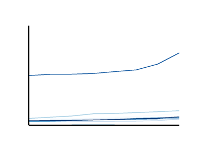
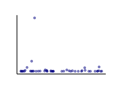
Data visualization is a powerful analytical tool leading to meaningful insights but depending upon the data your credit union is using, visualization can be challenging. Credit union data, like other types of financial data, is incredibly skewed because credit unions range in asset size from $20,000 to more than $100 billion and more smaller credit unions exist than larger ones. Outliers can distort graphs in such a way that makes it difficult to discern patterns.
What approach should be taken when working with this data?
Possible Solutions
Visualize the shape of your data
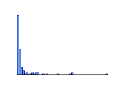
Showing the skew provides context. There are multiple chart types you can use, but the two most useful methods are a histogram or a table with a five-number summary, including the minimum, 1st quartile, median, 3rd quartile, and maximum of the data set.
Remove the outlier(s)
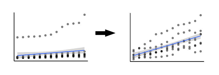
Outliers are important for understanding the data, but it may be in your best interest to remove them. Because call report data is self-reported, outliers can be the result of typos or errors, such as an interest rate being listed as 300% instead of 3%. If such an outlier is found, it should always be removed. Another situation in which removing outliers is preferable is when you’re trying to quantify an overall trend or build a predictive model. In either case, be sure to document the outliers removed and the reason they were removed.
Make the outlier the focal point
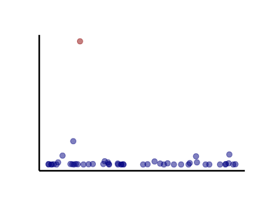
Sometimes outliers may be exactly what you want to visualize. By seeing which points physically stand out in a distribution, you can identify peer credit unions that are outperforming others.
Best Practice - Divide credit unions into groups based on asset size
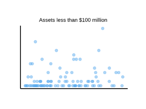
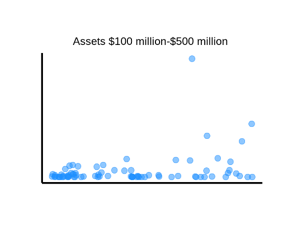
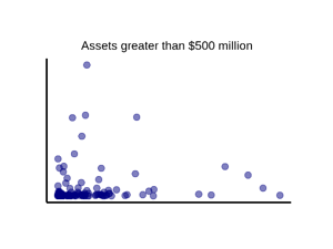
Why this works: Asset size is strongly correlated with many other variables in credit union data, such as total deposits, number of members, etc.
Why it’s best practice: Dividing credit unions by asset size allows for comparisons within peer groups and helps produce more insightful and actionable visualizations. Additionally, by controlling for asset size, credit union data analysts don’t have to worry about it as a confounding variable.
If you’re interested in learning more about your credit union’s data, CUCollaborate offers credit unions and other industry organizations in-depth, custom quantitative research and data science services, including macroeconomic analysis, benchmarking financial performance and data visualization. To learn more, please visit CUCollaborate.com.