102-year-old Workers Credit Union embarks on a brand identity journey

When your credit union’s logo conjures up associations with Waste Management, the trash people, you know you may be in need of a brand makeover.
Actually, the senior leadership team at $1.4 billion Workers Credit Union (WCU) in Fitchburg, Massachusetts, already knew they were due for a brand refresh. They just didn’t know how far and wide they should take the 100-year-old brand or name. In fact, they didn’t really even know how to get started. So, they called in financial brand experts Weber Marketing Group of Seattle, WA to get a fresh perspective, research and an assessment on the state of their brand and name equity.
WMG launched a multi-prong, 360-degree view and evaluation of WCU’s name, brand, marketing, advertising, digital and retail experiences. This evaluation provided WCU with enough strategic data to make what is arguably every organizations most important decision: the direction, care, handling and guidance of their brand, name and logo in order to remain relevant, appealing, motivating and differentiated in the commoditized world of financial services retailing.
Engaging all stakeholders on a journey of brand equity discovery
Members, non-members, employees, senior leadership team and the board of directors were all engaged to provide a meaningful articulation of varying brand, name, cultural and member experience perceptions. Each provided their perspective on how WCU was perceived in the marketplace and how well they were delivering on products, service, access, advice and helping members manage their money.
For the most part, Workers received high marks. WCU was seen as a great value and a trusted place for people’s financial needs. After all, you don’t grow into a $1.4 billion credit union without delivering what members want. Yet there were several key areas where the brand experience and image was not as effective as it could be.
The comprehensive brand audit examined every facet of marketing and provided observations and recommendations. Advertising messages, collateral, point-of-sale communication, digital, mobile and retail merchandising channels were all analyzed and presented in a detailed “State of the Brand” report. This assessment report, combined with the learning from external and internal market research, became the ultimate decision tool that the senior leadership and the board needed to help them make the right brand, name and marketing choices moving forward.
Is a name change the lever of repositioning needed…or a mistake?
Before the engagement, many of Worker’s internal stakeholders and decision makers felt a name change was badly needed. Often credit union industry names are tied 50+ years of past history or former legacy sponsor organizations. Many younger consumers are often confused by even the concept of what a credit union is.
In the case of Workers Credit Union, research showed the name compounded the confusion in the marketplace and provided some barriers to soliciting new member growth. Workers Credit Union. Those three words: all contained some confusing or even negative connotations among non-members. It was a formula for a name change, right? Well, not so fast.
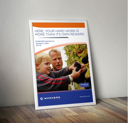
The voice of the consumer needed to be included in this conversation. Through an array of market focus groups, results found members loved their credit union name. Not surprisingly, they didn’t want it to change. Non-member prospects were also well aware of Workers credit union — and thought highly of its reputation. Everyone was aware of some of their highly popular programs like “Give Back,” where Workers shares a cash dividend once a year with members. Workers was at the top of their game – and the name did not prove to be a major barrier to joining.
Will expansion into new markets create brand confusion?
Workers Credit Union wanted to expand into the western fringes of the Boston metropolitan area: a region where they have low awareness and no branch presence. How would the Workers name and brand play there? The success of their expansion would hinge on attracting new members in a Boston commuter land that was predominantly Mass Affluent: with advanced degrees, high-tech jobs, dual incomes and high discretionary spending. Would they be attracted to an organization with a name as basic and potentially blue-collar sounding as Workers Credit Union?
As it turns out, research revealed, yes they would. The name resonated with many because everyone is a worker – unless you were born with a silver spoon or you won the lottery. The name was not a barrier and in fact had some character. It’s a real word, but it’s also one that is hard to trademark and protect.
The problem consumers revealed was not the name. It was the dated brand image, messaging and style. It was old, stodgy and unappealing. Remember the trash company logo reference? People didn’t give the credit union a second thought because the logo and marketing looked dated, uninviting and “not relevant to them”. The brand was in need of a total identity transformation if it hoped to appeal to this wider audience of potential members: especially more affluent ones.
The brand team at Weber recommended Workers CU retain its name, surprising management and the board. Well, mostly. WMG did recommend that Workers drop the confusing apostrophe (it was originally spelled Workers’) for the plural version of a worker… Workers Credit Union. This was to even further communicate an emotional connection that it was for every worker. The apostrophe suggested, “a credit union belonging to workers”. Without it, it became “ a credit union of and for workers”. The apostrophe also created confusion and SEO challenges in WCU’s website URL.
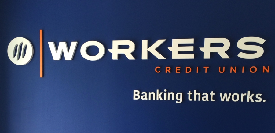
The first step in the identity journey was to update the logo, mark and color palette (from Waste Management’s green and yellow), to an arresting blue and orange, unique among their financial competitors. A striking logo mark was developed with a stylized “W” anchoring a brush stroke symbol with three vertical components. The goal of the new icon was to make sure it translated well across all online, mobile and digital screen devices.
![]()
Concurrently with the logo redesign, the crafting of the strategic Brand Platform was underway. It’s the engine that drives the credit union towards consistency and a common language and focus. WCU’s brand was distilled down to “high performance banking,” and this essence became the compass of its brand differentiator. From the research and high Net Promoter Scores, it was clear they needed to lean deeper into their relationship pricing value proposition even deeper in their brand messaging.
The new brand essence of “high performance” was further defined with the new brand promise: “We’ll work hard for your financial success.” This promise was culled from member research and high loyalty member comments like this: “I rate them a 10 due to low fees/no fees, good rates on checking and their cash back program. All my accounts are now with Workers because they outperform all my other accounts at other banks.”
With a well-defined new brand platform, and a bold new logo and identity package, it was time to design the new brand identity and look & feel. WMG’s bold visual and tone of voice concepts gave the high performance banking it’s distinctive personality and style that now appeals to their mass affluent targets. The brand promise of “We’ll work hard for your financial success,” combined with their name Workers, was translated into a memorable, external brand tagline of simply: “Banking that works.”
When the new identity was unveiled in mid-2016, CEO Doug Peterson remarked, “this change isn’t just about logo or colors… it is much more. We have a strong history of providing a great value for our members and this is about making that commitment and experience clear, simple and appealing.”
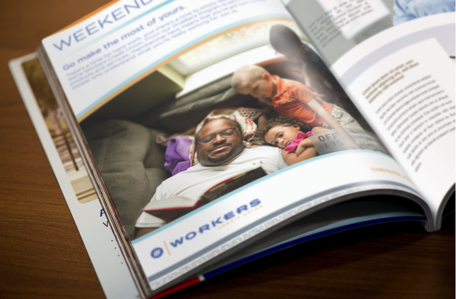
The Weber Marketing retail team helped audit, renovate and update their 14 branches to reflect the brand program and bold new identity. New signage, brand paint colors and a robust interior messaging and merchandising system richly expresses the brand image in a fresh, and consistent new experience. The brand has now come to life and clearly differentiates Workers from their bank competitors.
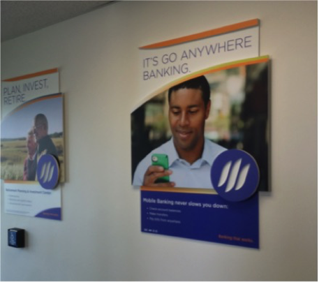
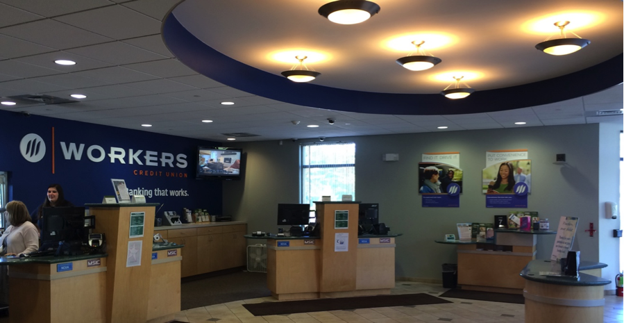
Chief Operating Officer Sandra Sagehorn-Elliot said the branch changes are to “modernize” the credit union so that its image “matches what we provide in terms of value, energy and high performance experiences to our members.” Other member touchpoints were rebranded, including launching Apple Pay, new smartwatch apps and a refreshed mobile app to simplify members’ financial lives.
Although Weber Marketing has successfully renamed over 65 financial institutions, the Workers CU story shows why retaining a name with solid equity and rebranding the image and experiences can be just as powerful a growth strategy.
“The key to brand and name decisions, is to involve the voice of the consumer,” says John Mathes, Director of Brand Strategy for WMG. “Sometimes a name change is clearly called for. But when you have a strong, viable and protectable name, it suggests diving deeper into the reasons your brand is confused or not yet well-articulated, that’s stifling growth goals. Evaluating changing the name of an organization requires careful examination of your equity, growth strategies and as many strategic data points as possible.”
“Weber’s logical and pragmatic approach to brand development made so much sense to everyone, even the non-marketing people which is so important to making it successful,” said John Doyle, SVP/Retail Services at Workers Credit Union. “Their guidance was immeasurable to keep me and the entire brand team on track and committed to making this transition happen.”