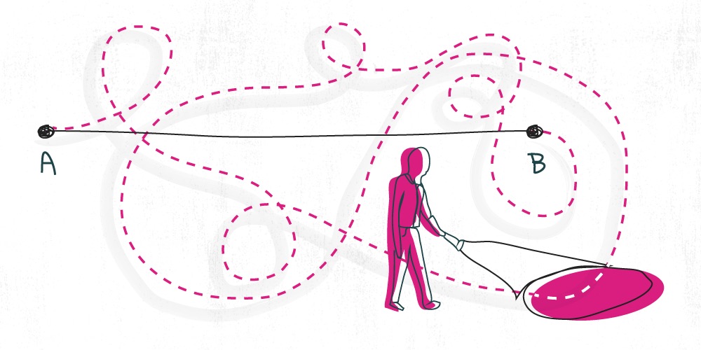
Your navigation system is one of the most important parts of your credit union website design. A good navigation system helps people easily find what they want; and a poor one causes people to bounce before they even make it past your homepage.
My company, BloomCU, has designed websites for credit unions all across the US—in 25 different states—and below are some of the best things we’ve learned along the way.
1. Users expect to find credit cards under "Accounts" or "Cards", not under "Loans"
As odd as it may seem, that’s one of the things we learned from doing card sorting studies with 12 credit unions and 300 consumers. From that data, we found people usually group card products and services with “Accounts'' or in a category of their own (“Cards”). Which one they choose depends on the number of card products and services you have:
- If you have 1-2 card products and services, then group them with “Accounts”
- If you have 3+ card products and services, then create a new group for them called “Cards”
Additional Reading:
Why you shouldn’t put credit cards under “loans” on your website
2. Noun-labels are nearly twice as easy to navigate as verb-labels
Some credit union navigation systems use noun-labels like Loans and Accounts and others use verb-labels like Borrow and Save. We conducted a usability study and found that nouns are nearly twice as easy to navigate:
"When given verb-based labels, users took a median of 19.8 seconds to find the correct pages. On the other hand, when given nouns, they took only 10.6 seconds. The takeaway is obvious: Use nouns for your navigation rather than verbs."
Additional Reading:
Noun-based labels make websites nearly twice as easy to navigate
3. People can't process groups of more than 7 items
Miller’s Law says that the number of objects an average human can hold in working memory is 7 ± 2. Therefore, groups in the navigation should contain about 7 items or fewer (9 max, but never fewer than 2).
Additional Reading:
5 Laws of Credit Union Website Design.
4. People look for topics before format of content
Initially, "users interested in a specific topic usually don’t care in what format the information will be delivered to them" (Avoid Format-Based Primary Navigation). That means you could organize your navigation by topic rather than formats like videos, podcasts, articles, etc.
5. People best remember the first and last things they see in a list
"This is known as the serial position effect. The tendency to recall earlier words is called the primacy effect; the tendency to recall the later words is called the recency effect" (Serial Position Effect).
Therefore, this is how you can list items in your navigation to make the most important things stand out:
(1) 1st place by importance
(3) 3rd place by importance
(5) 5th place by importance
(7) 7th place by importance
(9) 9th place by importance
(8) 8th place by importance
(6) 6th place by importance
(4) 4th place by importance
(2) 2nd place by importance
6. Users are more likely to find the mobile banking app under the label "Online & Mobile" than "Digital"
We conducted a usability study with 30 consumers to find the best navigation label for digital services like a mobile app. When the mobile banking app was nested under the label "Online & Mobile", we saw a Screen Usability Score of 94 (see report). On the other hand, we got a score of only 50 when nested under "Digital". While we can’t say definitively that "Online & Mobile" is the best label, it has beaten all of the competitors we’ve thrown at it so far.
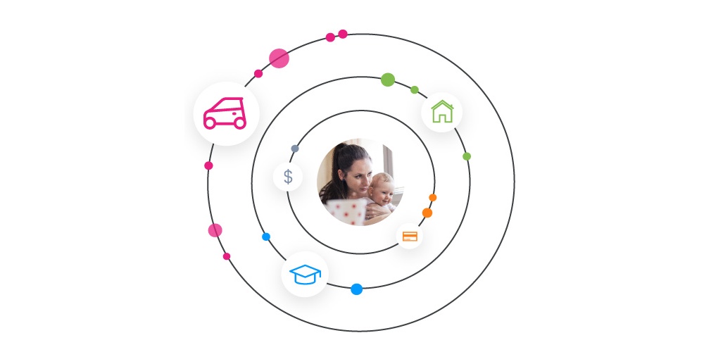
7. People don't understand made-up names for products and services
For instance, no one shows up on a credit union website looking for a "Gold Checking" account, but people will come looking for "High-Interest Checking".
A name like "Gold Checking" doesn't tell you it's a high-interest checking account. So, it would be better to simply label it "High-Interest Checking" in the navigation so it's clear what the product is. Once they land on the product page, then you can tell them your high-interest checking account is called "Gold Checking". Therefore, use generic names for products and services rather than fancy, made-up ones.
Additional Reading:
Use Old Words When Writing for Findability
These 7 tips help us create better navigation for credit union website designs. To learn even more ways to improve your navigation, check out the other insights from the Navigation category in our blog.