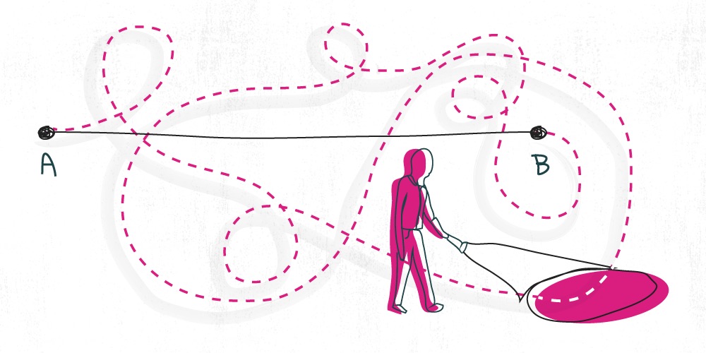
When looking to get more online applications, it’s tempting to focus on the end of your website’s funnel: “Is my product page compelling enough?” or, “Is my credit union’s third-party application platform up to scratch?” Those are good questions, but your website’s conversion funnel starts before the product page. And if you don’t give attention to the top of the funnel, you’ll lose a lot of potential members and borrowers.
The first micro-conversion that happens on your website is someone deciding to navigate from a landing page (most often your homepage) to a product page. The percentage of people who successfully navigate is what we call Navigation Rate. Let’s take a look at how increasing your Navigation Rates can help you get more applications for loans and accounts. In this article we’ll talk about a case study we conducted on Navigation Rates and takeaways from that experiment.
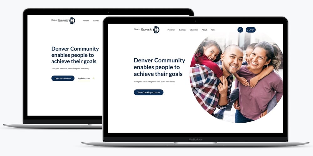
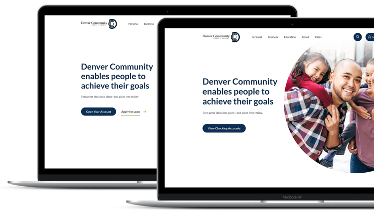
Case Study with Denver Community CU
BloomCU ran an experiment with Denver Community Credit Union (DCCU) that shows the impact a website’s Navigation Rates can have on overall conversion rates.
The goal
Denver Community wanted to open more checking accounts. Like many credit unions, they opted for a land-and-expand strategy: get members in the door with a “sticky” product like a checking account, get them to use Denver Community as their primary financial institution, and then offer them loans and other products to expand the relationship.
The hypothesis
First, we looked at how many checking accounts Denver Community was getting through its website to find opportunities for improvement. One opportunity we found was to make the calls to action (CTA) on the homepage specific to checking accounts. Our hypothesis was that checking-focused CTAs on the homepage would drive a lot more people into the checking funnel and, ultimately, get more people to open accounts.
The a/b test
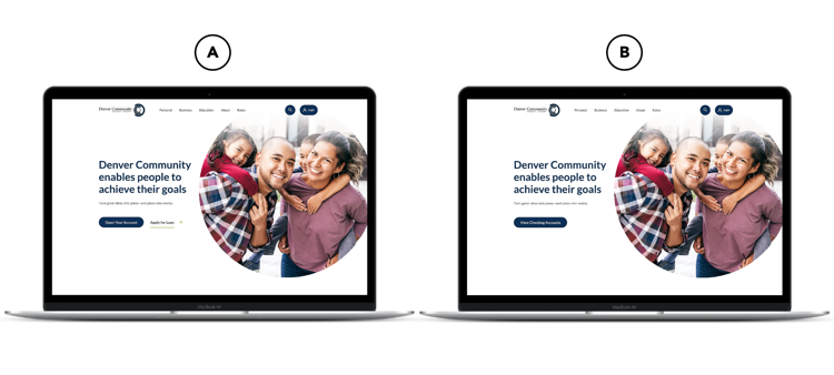
We ran an a/b test to see how changing the homepage CTAs would impact Denver Community’s Navigation Rate and overall conversion rate for checking accounts. We wanted to see if an increase in Navigation Rate would cause an increase in leads.
Also, we thought a CTA to “Apply for a checking account” would be too heavy for an initial call to action. If a visitor is at the early stage of the buying decision process, they might want to shop around and compare accounts before applying. So, asking visitors to immediately “open a checking account” could scare them off. (In other words, you should date before asking them to marry you.)
In fact, a set of five studies on GoodUI.org shows that gradual engagement increases conversion by a median of 20%. If you design a website experience that invites users to engage just one little step at a time, then you could get 20% more applications. So, for the experiment version in our a/b test, we opted for a softer CTA: “View Checking Accounts.”
The results
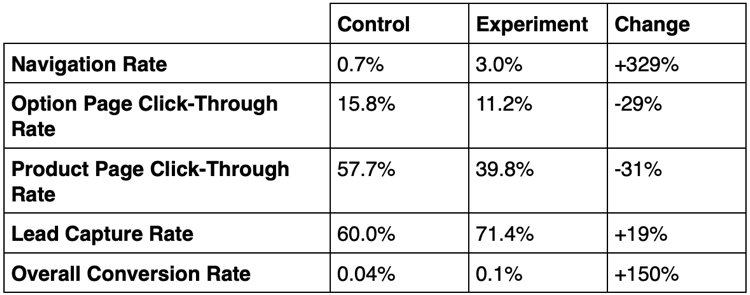
Now let’s compare the results of the control vs the experiment.
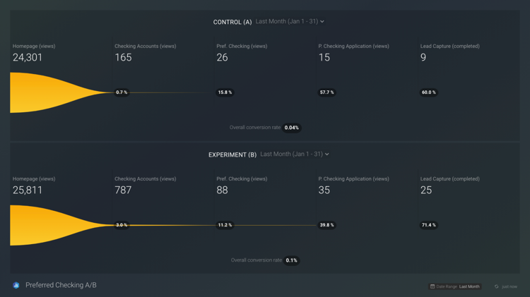
The most notable changes are in the Navigation Rate and Overall Conversion Rate. For Navigation Rate, the control version (i.e., what Denver Community started with) got 0.7% and the experiment got 3.0% (that’s 4.3x higher). For Overall Conversion Rate, the control got 0.04% and the experiment got 0.1% (that’s 2.5x higher).
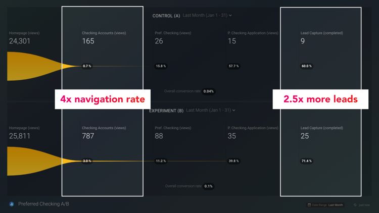
Note: These results scored 99% statistical confidence.
The takeaways
What can we take away from this experiment?
- Navigation Rates matter. If you pay attention to your Navigation Rate and optimize it, you can see big results at the end of the funnel.
- Growth requires focus. We had to decide to focus the homepage call to actions on checking accounts in order to produce these results. If we had divided our focus by trying to promote several products on the homepage at the same time, we probably would have seen less favorable results.
A few more tips to increase your website’s Navigation Rate:
- Gradually engage users with easy calls to action (remember to date before proposing marriage)
- Make your calls to action stand out visually
- Test new ideas with a/b testing and usability testing (GET OUR USABILITY TESTING WORKSHEET)