
You're about to spend five or six figures on a credit union website design, but you'll probably waste your budget.
Why? Because you're measuring the wrong things.
You'll judge your new site by how good you think it looks, how many compliments it receives, or how many awards it wins.
But are those the right targets?
Don't get me wrong, your website should be beautiful. But your mom taught you to look for more than just a pretty face, right?
A true story: What Soviet shoe factories and credit union websites have in common
Let me tell you a true story that highlights how vital it is to measure the right things.
In the old Soviet Union, the government told shoe factories to produce a certain number of shoes. These were supposed to be regular, everyday shoes for people of all ages. But the factories weren’t judged by how wearable the shoes were, just how many they made. So, they made lots of children's shoes, because small shoes used less material and could be made faster. Though the factories hit their quantity goal, there was a shoe shortage for adults.
So the government changed the rule. Instead of counting how many shoes were made, they said, “Make this total weight of shoes.” Again, the factories reacted accordingly. This time, they made lots of heavy boots in very large sizes. The boots were so big and clunky that few people could wear them comfortably.
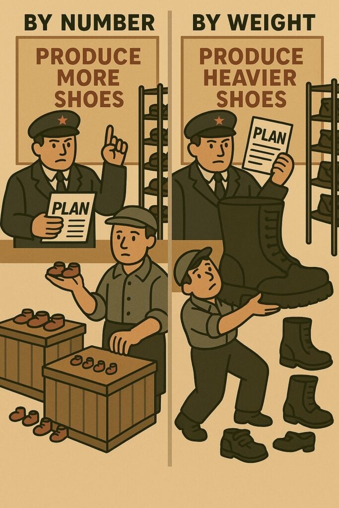
By the 1980s, the Soviet Union was producing about 800 million pairs of shoes a year—more than any other country in the world—three times as many as the United States. But despite all the output, people stood in long lines, desperate to buy a pair of shoes that actually fit.
(This story was cited by journalist Scott Shane in "Dismantling Utopia".)
The problem wasn’t how many shoes were made. It was how the success of the factories was measured.
Does your website have the same problem?
If you're like most credit unions, the answer is yes.
That's why credit union website design needs to transform—from art to science.
Are you in the website redesign trap?
Here's how you know you're in the trap:
You redesign your website every three to five years: new colors, images, fonts, layouts, and maybe even an award or two. But you still can't answer this question:
How many of your website visitors are applying for loans and accounts?
If you can't answer that question, you're in the trap—measuring the wrong things, getting no results, and wasting your budget.
My story: How I escaped the website redesign trap
The good news is that you can escape. I know because I was once in your shoes.
A decade ago, my company started doing credit union website design. Initially, our goal was to design beautiful websites and win lots of awards—and we did.
We worked with credit unions all across the country and won lots of Diamond Awards, CU league awards, and the like. One year, we even won more than half of all the website Diamond Awards given by CUNA.
I’ll be honest: winning all those awards felt great. Who doesn’t love being recognized for their work?
But over time, something started to gnaw at me.
We were winning awards, but we had no idea if those sites were actually doing what they were designed to do: get people to apply for loans and accounts. We were designing websites based on opinions and we couldn’t answer the most important question: Are these sites converting visitors into members and borrowers?
That was deeply unsettling.
So, we changed. We stopped relying on gut instincts and started seeking the truth. We began measuring conversion funnels. We started running A/B tests—crucial experiments to learn what actually converts. And once we started seeing real results, we couldn’t look away.
That mindshift completely changed how we approached websites—from focusing on winning awards to focusing on helping our clients grow. Since then, we have run about 100 A/B tests and helped credit unions generate about $144M in new loans and deposits. That’s the stuff I’m proud of now.
You can transform your thinking and approach, too.
Why you're still stuck in the website redesign trap
I've asked countless credit unions this telling question:
"Once you have a brand new website, what do you want it to do for your credit union?"
The answer is almost always, "We want it to help us get more members and borrowers."
But there is a disconnect between that answer and what actually gets measured. Instead of tracking how many loans and deposits your website generates, you fall into the trap of focusing on personal preferences and awards.
One of the key symptoms of this misaligned mindset is budgeting for redesigns every five years, but nothing in between.
Here’s how the redesign trap works:
- You say, "Our site looks bad." Or, "It doesn't match our brand."
- So, you design a new website, launch it, and say, "That looks great!"
- Then, you don't measure the results! Maybe your visitors are applying for loans and accounts. Maybe they aren't. Who knows? 🤷♀️
- After a few years, you repeat the process. Nothing really improves. Your website is just a cost center.
Redesigning your site every few years and then doing nothing to measurably improve it is like watering a plant once and expecting it to thrive for years.
A great website isn't just launched—it’s grown, and gets better and better over time.
How to escape the trap: Measure your site's success
The real value of your website comes after launch—when people actually use it to learn about your loans and accounts.
That means not just doing a redesign, but measuring conversions on an ongoing basis. Measurement is what transforms credit union website design from an art into a science.
That means budgeting beyond the redesign for analytics and improvements—continuously.
You might be thinking, "Wait, you're saying we need to spend even more money on our website?"
Your website isn’t a cost center. It’s an ROI generator—it should be producing millions in loans and deposits, year after year. But most credit unions are leaving millions on the table due to poor conversion rates. So, yes, you should be spending more on an ongoing basis in order to get more ROI.
Here's what your website approach should look like:
- You say, "Based on our analytics, our website isn't converting enough visitors into members and borrowers."
- So, you redesign your site, launch it, and say, "That looks great! Let’s see how it performs."
- You measure the results.
- You continuously test and improve the user experience.
- You generate more loans and accounts every year. 🚀
Under this model, website improvements happen because your site has potential to bring in more dollars—not because the calendar says it's time.
If you want to grow, ask better questions
My company's transformation started by asking ourselves these questions:
- How should things be? This question helped us think deeply about what matters most. This led us to ditch our focus on winning awards and instead help our clients grow.
- Forget 2x growth, how can we achieve 10x growth? We realized we were stuck in 2x thinking, which led us to focus on incremental improvements that didn't really move the needle.
- What do we really care about? When we asked ourselves this question, we realized that we care about seeking the truth. We don't want to just accept the status quo or unfounded opinions. That's why we're attracted to analytics and A/B testing because they are tools for finding truth.
Asking better questions led us to think differently and reshape our whole company philosophy. In fact, I keep a sticky note on my desk as a constant reminder.
It may look like a simple sticky note—but these 14 words contain the philosophy that has led to $144M of growth for our clients:

Translation: The primary job of a credit union website is to open more loans and accounts. The only way to learn what causes conversions is to run experiments after launch (A/B testing). From those tests, we learn "proven patterns"—what actually works.
That framework has become the foundation of our business—and it came about by asking thoughtful questions.
Seek the truth
So, I ask you: Do you know how many of your website visitors are applying for loans and accounts?
Fintechs already know. It’s time credit unions did, too.
If you want to find out—and actually improve your site—sign up for MetriFi (takes 3 minutes). That's why we built it: to help credit unions learn the truth about their websites.
That’s the kind of truth your growth depends on.