Voyage FCU knows how to guide people to their financial dream destinations, but first they need to become members of the credit union.
Like most credit unions, Voyage wants to grow its membership, and they know their website can help them attract more people. And that’s how I came into this story: My company, BloomCU, designed a new website for Voyage last year and we continue to help them optimize it to generate more leads and applications.
With the goal of getting more members, we analyzed voyagefcu.org to see how it could be improved. In our review, we found that Voyage’s membership application was pretty long.
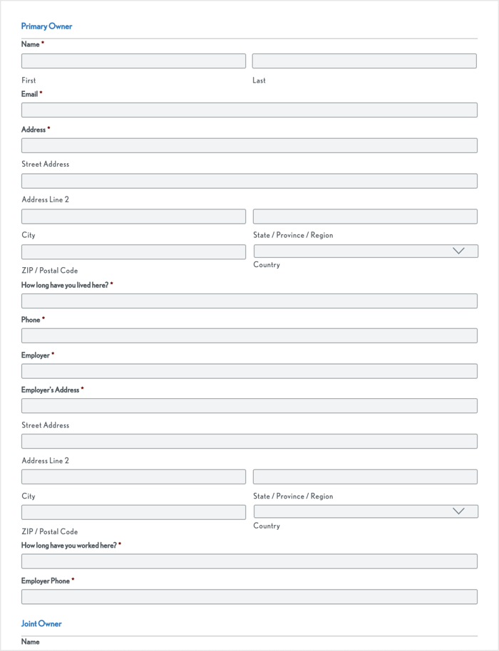
This is only about half of the membership application that was being used on voyagefcu.org.
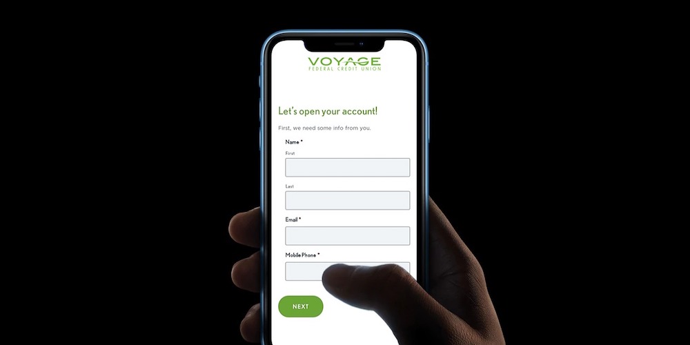
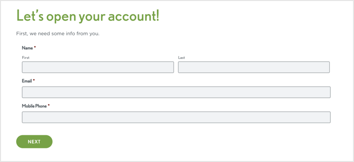
Asking someone for so much information upfront is intimidating. Plus, a person has to complete the entire form before Voyage even knows who they are. So, we hypothesized that a better approach would be a multi-step form that breaks the application into two steps:
- Step 1 - lead capture: First, we’ll ask for the applicant’s name, email, and phone number. That way, we have the option to manually or automatically email, text, or call them to help them through the account opening process.
- Step 2 - remainder of the application: After capturing the lead, we’ll ask the applicant to complete the rest of the application. Since we need so much info, some people won’t finish the application, but we can reach out to help them complete it.
We also wanted to increase the number of calls to action on the membership page from one to four because we know repetition tends to increase conversion rates.
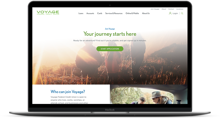
We created a B version of the page that repeats the call to action “Start Application” in each section of the page, for a total of four times.
Next, we ran an A/B test to see how our hypotheses would work out. When people visited the membership page, we showed about half of them the original call to action and application form (version A). The other half saw a new version of the page with more calls to action and a multi-step form (version B).
We ran the test until it reached 99.98% statistical confidence (to trust test results, you want to see 95% or higher):
Version B won convincingly by generating 175% more leads and 35% more applications.
Version A conversion rate: 3.7%
Version B lead capture rate: 10.2%
Version B completed application rate: 5%
Based on the results, we implemented the multi-step form and repetition of calls to help Voyage get more members.
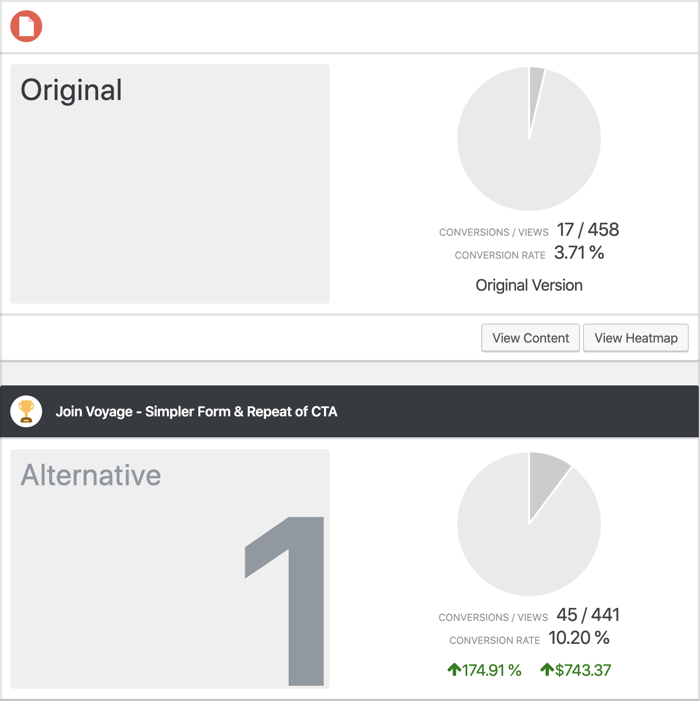
A comparison of the leads generated by version A (the “Original”) and version B (the “Alternative”) of the page.
Takeaways
- Always capture leads at the beginning of your application process because then you have the opportunity to follow up with people who don’t complete it (most people won’t complete it on their first visit)
- Multi-step forms can help you capture leads before asking applicants to complete the entire application
- Repetition of calls to action can help you increase conversion rates