
Logos you love … and what they say about credit union logo development
It’s true, your brand is more than a logo. But a great logo is still important.
Your logo is a visual representation of who you are. When consumers see it, they see the way you do business. Your logo makes you instantly recognizable to those who know you, and it sparks interest in those who don’t know you.
So, what goes into an incredible logo? Let’s review some classic logos from other industries and see what lessons they have for the bank and credit union logo development process.
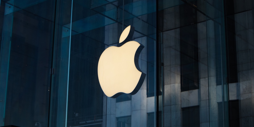
1. Apple
Since 1977, Apple has kept its iconic logo fairly consistent (besides some color changes). The logo is…well…an apple, but with a bite out of it. If you recognize the fruit, you instantly know the company name. The logo’s monotone color allows the freedom to add more vibrant design elements when necessary.
continue reading »