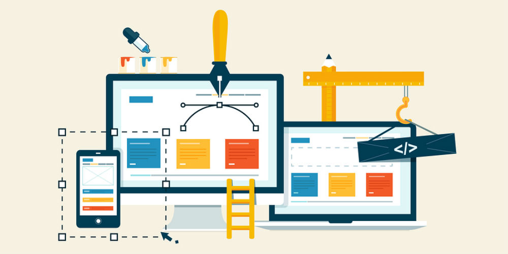
PR Insight: Three key elements of a successful website renovation
Your credit union’s online ‘business card’ is the first stop for prospective members.
For many businesses, including credit unions, the summer season can have more downtime than the rest of the year—financial matters are often pushed aside to be readdressed in the fall after vacation season is over. This slow period is the perfect time for CUs to capitalize on lighter schedules and focus on revamping their websites. Ultimately, a website is a credit union’s business card and is one of the first resources a prospective member turns to when researching an institution’s products and services.
Redesigning your credit union’s website is a big project with valuable benefits. In many ways, your website is your CU’s biggest branch. According to a recent Pew Research survey, 51 percent of adults in the U.S. use online banking, which means your website must be a fully-functional marketing tool that attracts and engages your ideal member.
Here are three sure-fire ways credit unions can renovate their websites to best promote their institution’s value.
1. Make a good first impression.
Your homepage is the face of your credit union—and you only get one chance to impress visitors. The website should be compelling and visually appealing and exhibit an easy-to-use interface. It’s all about simplicity; in fact, a recent HubSpot survey noted that the most important factor in the design of a website is whether or not it is easy to find what you need. Project leaders must keep the following questions in mind when redesigning a website: Does it look professional? Is it easy to navigate? Is it aesthetically pleasing? When existing and prospective members land on the website, do they feel welcome and secure?
continue reading »