Credit unions constantly run promotions on their websites, but they usually do it wrong. Marketers need to tell members about deals, sell them loans, and encourage them to open accounts. However, most credit unions treat promotions like a game of Yahtzee: just roll out a promotion and hope you get a full house. Instead of rolling the dice, a better way to promote is to use strategy and data.
All too often, promoting is done without any strategy or data. At BloomCU, we call thoughtless, data-less promotions “blind promotions” because they are just shots in the dark. Unfortunately, most credit union website designs are dominated by blind promotions. Blind promotions usually come in the form of untargeted ads posted on a homepage. Perhaps you’ve seen a slider that proclaims “Low Rates on Auto Loans!” There’s nothing wrong with promoting low auto loan rates. The problem is promoting auto loan rates to every single person who visits your website when most visitors aren’t interesting in buying a car right now—and aren’t going to buy car right now, no matter how good your rates are.
In all but a few cases, blind promotions are just not a good idea. Instead, there’s a more strategic approach to promoting products on your website.
The Logic of Blind Promotions
A blind promotion has three potential outcomes:
- It will align with a user’s interests
- It will change a user’s interests
- It will create a new interest
Let’s take a look at the merit of these three potential outcomes.
#1 Blind Promotions that Align with a User’s Interests
Aligning with a user’s interests is a good goal, but blind promotions don’t achieve this goal most of the time. Chet Holmes, author of The Ultimate Sales Machine, explains that if you pick one of your products at random, only 3% of your target audience wants to buy it right now, which means the other 97% don’t want it.
Let’s say someone comes to your website wanting to sign up for a checking account. When they land on your homepage, they are immediately and aggressively pitched an auto loan. As a result, they may feel uncomfortable and untrusting. A study by consumer data lab Jainrain revealed that 74% of online consumers get frustrated with websites when content (e.g. offers, ads, promotions) appears that has nothing to do with their interests.
#2 Blind Promotions that Change Users’ Interests
Changing a user’s interest is an interesting goal. Why would you want to change a user’s intent, especially when you don’t know the user’s intent? If I’m coming to your website to get a mortgage, do you really want me to get an auto loan instead?
In line with the well-documented buying decision process, people don’t often change their objectives because they are shown promotions. Users come to your website because they recognize needs in their lives. When a user sees a promotion that does not align with her need, she doesn’t think, “Oh, I should buy a car instead of a house.” No, she thinks, “That auto loan promotion is irrelevant to me,” and she ignores it because a car isn’t a good substitute for a house. (Though, I keep trying to persuade my wife we need to buy a self-driving car before we buy a house. Thus far, she isn’t convinced.)
#3 Blind Promotions that Create a New Interest
Potential outcome #3, create a new interest, assumes that introducing new promotions will create more demand for more products without getting in the way of a user’s original intent. By that logic, you should never try to align promotions with users’ interests because that would be a wasted opportunity. Instead, the best approach would be to show a new promotion to a user on every visit because every new promotion would create demand for a new product.
In your experience, does that approach make sense? Not really, because people have limited bandwidth—they can do and think about a limited number of things at once. So, you’re best off helping a member get the one thing she’s interested in right now rather than trying to get her to sign up all at once for an auto loan, an IRA, a Platinum Credit Card, an Ultimate Checking Account, a personal loan, and a safe deposit box.
Blind promotions resemble ads
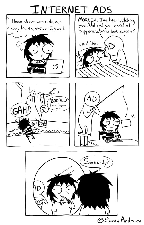
Source: Sarah’s Scribbles
Another reason to be cautious about using blind promotions is that they resemble ads (in fact, they are ads)—and people hate ads. The more traditionally “ad-like” the promotion, the more people are likely to shy away from it. According to AdKeeper, 54% of people say they have never clicked on an online ad, because they find them to be untrustworthy. Appearing untrustworthy is dangerous for a financial institution.
Furthermore, only 9% of all online ads are viewed for more than one second. There is a part of most people’s brains that shuts off completely when they see an online ad; we have programmed ourselves to ignore them. The propensity to ignore ads is a phenomenon known as banner blindness.
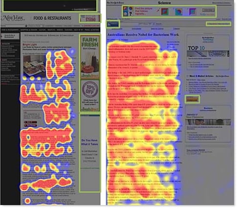
A good example of banner blindness, from UAIC. The red and yellow show where people’s eyes linger on the page.
What can you do instead of a blind promotion?
Rather than making your home page a place for you to tell people what they want, just listen. Help people find what they want and then sell it to them. Here’s how we explained this approach in another article about the buying decision process:
When customers walk into your credit union branch, your employees don’t bum-rush them, shouting “DO YOU NEED A HOME LOAN?!?” or “WANNA BUY A CAR?!?” Instead, they probably ask something more like, “How can I help you?” This approach is so easily understood for in-person interactions, but somehow gets lost in credit union website design.
The same approach that applies to in-person interactions applies to digital interactions: first, discover what a member is looking for; then, you can do a much better job of helping them. As Stephen Covey, author of The 7 Habits of Highly Effective People, says, “Seek first to understand, then to be understood.”
How to do you “listen” through a credit union website design? Your home page should be simply designed and ridiculously easy to navigate. If your navigation system is well-organized, users will tell you what they want by navigating.
You might also consider smart technology, like a chatbot that can guide users to specific products. We have built chatbots for a couple of credit union websites and they’ve proven to be quite effective at generating engagement. The overall key is to listen to what a user wants first, and then pitch. Once they land on your auto loans page, that’s a perfect time to sell them on your personal service and competitive loan rates.
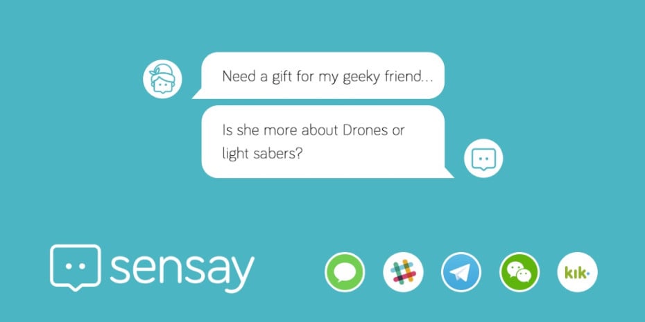
Chatbots like Sensay can help users find what they’re most interested in.
If you listen and deliver a personalized experience, you’ll have even greater success. A study by MyBuy found that 40% of consumers buy more from retailers who offer personalized experiences through their marketing channels. In another study, HubSpot found that calls-to-action targeted at specific users had a 42% higher view-to-submission rate than calls-to-action that were the same for all site visitors.

Great example of a personalized call to action, from AcquireConvert.
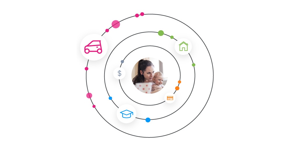
At BloomCU, we set up our clients with personalization software called Persona, which collects data about users interests. Then, in real-time, Persona adapts website content based on a user’s interest. Let’s say a visitor named Carl visits your Mortgages page. Next time Carl visits the homepage, Persona shows Carl more content about home loans. Eventually, you’ll have enough data to not only show Carl personalized content, but to organize your entire userbase into different groups, all with their own data-backed interests and preferences. (You can learn more about personalization software in our previous blog post.)
Is there a place for blind promotions?
Despite the evils of blind promotions, there is a time and place for them. Instead of being a front-and-center player, blind promotions work better as a last ditch effort. If someone is leaving your site and you know nothing about that user, you can use a blind promotion to say “Come back. We might have something that’s interesting to you.”
The most common ways people bounce from credit union websites are (1) through the online banking login and (2) by closing the tab or clicking back in the browser.
With that in mind, appropriate places for blind promotions might be:
- Next to the login (preferably hidden until someone actually clicks a login field)
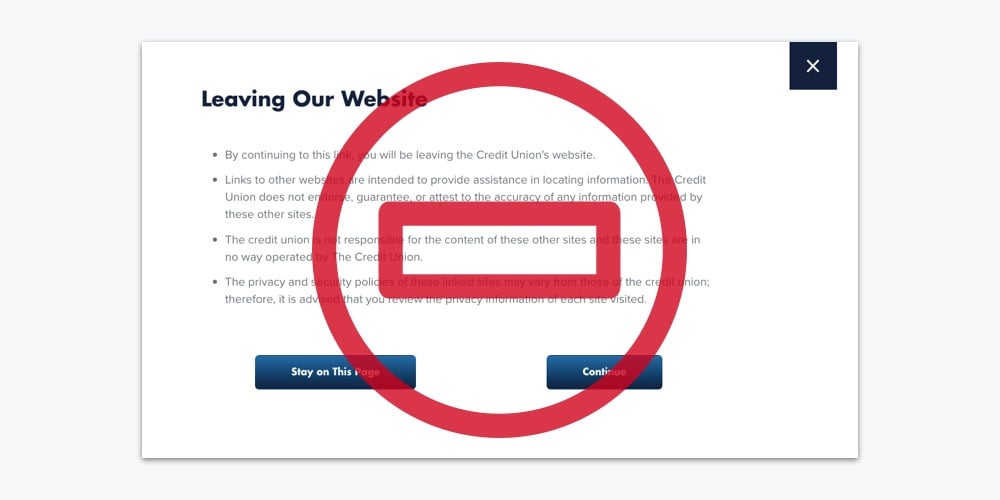
- Exit-intent popups (which have the potential to be very annoying if not handled tastefully)


Exit Popups, like the example above, may be an acceptable way to run a blind promotion, if done tastefully. Find more examples at MaxTraffic.
Blind promotions can be useful when shown at the right time and in the right place, but remember: personalized promotions are always better. If you use your credit union website design to listen to what a user really wants, and deliver it to them, they are far more likely to take action.