The data is compelling: interactive websites get more engagement and conversions. That’s why interactive features are becoming more and more prominent in credit union website design.
GoodUI.org published a series of studies from organizations that put interactive features to the test. Inspired by GoodUI’s evidence, we helped Spirit of Alaska FCU launch an interactive website experience in May 2017.A few months later, we now have some interesting data to share.
Evidence from GoodUI
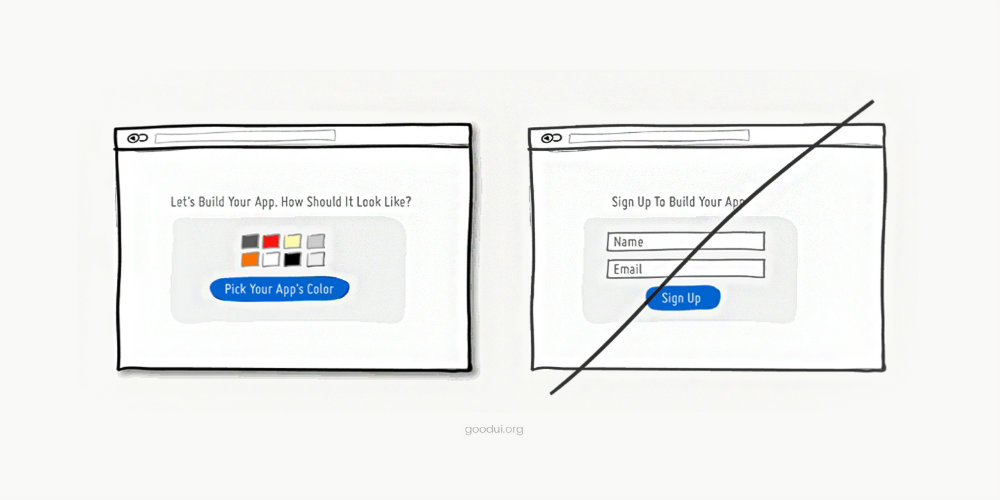
First, let’s look at some of the studies published by GoodUI. Specifically, we’re going to look at examples of websites using “Gradual Engagement.” As the name implies, the big idea behind Gradual Engagement is to get users to immediately and gradually engage with your credit union website design. Based on five studies, Gradual Engagement increases conversions by 20%, on the median.
Here’s how GoodUI introduces Gradual Engagement:
Instead of asking visitors to sign up immediately, why not ask them to first perform a task through which something of value is demonstrated. During such initial interactions, the product can both show off its benefits, as well as lend itself to personalization. Once users begin to see your product’s value and how they can make it their own, they will then be more open to sharing additional information with you. Gradual engagement is really a way to postpone the signup process as much as possible and still allow users to use and customize your application or product.
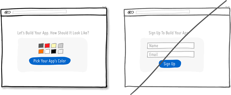
Example of gradual engagement from GoodUI
Case Studies
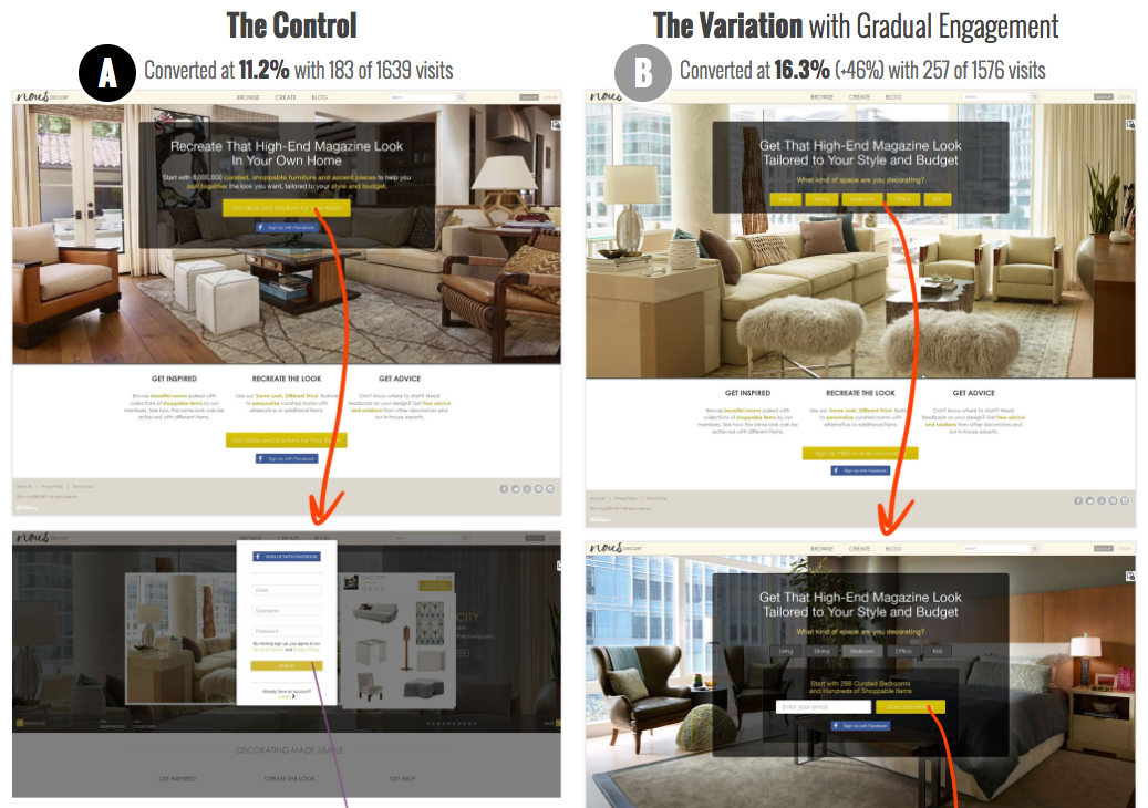
Below are three case studies from GoodUI. All three studies are A/B tests that show “The Control” on the left and “The Variation with Gradual Engagement” on the right.
Test 25: Room Type Choice Before Signup
In “Test 25: Room Type Choice Before Signup,” rather than asking users to sign up right away, the website first asks, “What kind of space are you decorating?” Using gradual engagement in this way increased conversions by 46.0%, from 11.2% to 16.3%.
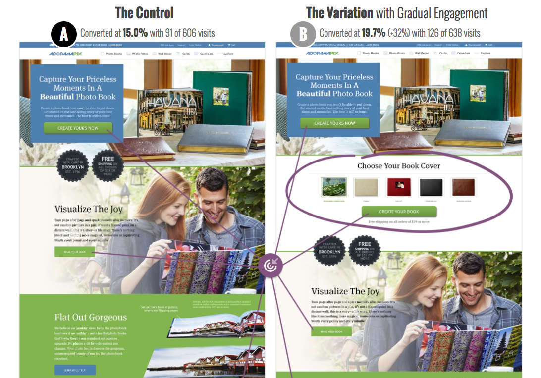
Test 27: Gradual Book Covers
In “Test 27: Gradual Book Covers,” users are prompted to, “Choose Your Book Cover.” In this test, gradual engagement increased conversions by 32.0%, from 15.0% to 19.7%.
Test 36: Gradual Reassurance
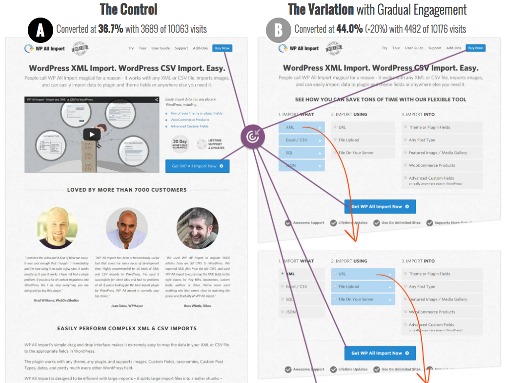
In “Test 36: Gradual Reassurance,” the website suggests to users, “See how you can save tons of time with our flexible tool,” then provides an interactive experience that requires user inputs. This gradual engagement approach increased conversions by 20.0%, from 36.7% to 44.0%.
How to Get More Interaction from Your Credit Union Website Design
Starting a relationship with a simple interaction builds trust. For example, you have a better chance of getting a first date if you suggest lunch rather than propose marriage.
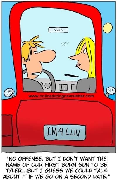
Courtesy of onlinedatingnewsletter.com
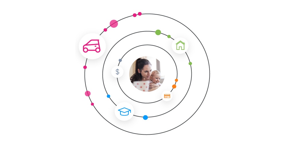
Remarkably, web design and dating follow the same principle: you’re more likely to get engagement (no pun intended)—and ultimately conversions—if you start by asking for smaller commitments. On their first visits, ask your users to do something effortless. For example, you could gradual engage users by giving them a way to tell you their interests:

This is snippet of Yolo FCU’s new homepage design, launching later this year.
After you engage users initially, then you gradually move toward something more serious, like asking them to start an application for an IRA.
How SpiritofAK.com Gets High Interaction
We wanted to incorporate what we learned from GoodUI’s studies into a credit union website design. So, we talked with Spirit of Alaska FCU about gradual engagement and showed them the studies on GoodUI. They agreed we should create a gradually engaging experience for their new website.
As result of our conversations with Spirit of Alaska, we built a snazzy chatbot for SpiritofAK.com and, appropriately, named her Aurora. When users arrive on the homepage, Aurora says, “Hi! I'm Aurora, your new virtual assistant. Is there something I can help you find?”
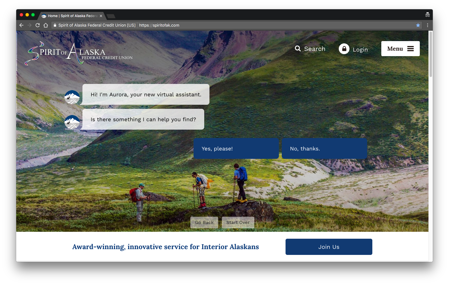
Aurora, featured on the homepage of SpiritofAK.com
If the response comes back, “Yes, please!” then Aurora asks some questions so she can guide the user. Depending on users’ needs (auto loan, credit card, saving account, etc.), Aurora directs them to specific pages.
Here is some interaction data for Aurora, June 29 - August 1:
Interaction Data - Totals
This data encompasses all interactions with Aurora on SpiritofAK.com’s homepage.
Raw Data
- Total Impressions: 27,333
- Total Unique Interactions: 923
- Total Interactions: 2,006
Performance Metrics
- Total Unique Interaction Rate: 3.4% ( 923 / 27,333 )
- Total Interaction Rate: 7.3% ( 2,006 / 27,333 )
Interaction Data - Personalized Homepage Content
This data is for interactions with Aurora when Aurora personalizes content for users.
Raw Data
- Impressions: 4,142
- Unique interactions: 414
Performance Metrics
- Personalized Content Interaction Rate: 10.0% ( 414 / 4,142 )
Analysis of the Data
We don’t know the interaction rate of the average credit union website—and you’d probably have a hard time finding that data—but I guesstimate it is 1% or less based on the fact that the majority of credit union websites use sliders and sliders typically get interaction rates of 1% or less. (Unfortunately, most credit unions have no idea what their interaction rates are. If you know the homepage interaction rate of your credit union website, I’d love to hear about it in the comments!)
Assuming my guesstimate of “1% or less” is accurate, Aurora’s Total Unique Interaction Rate of 3.4% and a Personalized Content Interaction Rate of 10.0% means SpiritofAK.com gets 340-1000% more interaction than most credit union websites, depending if content is personalized or not.
More Ways to Engage Users
If want to get more interaction from your credit union website design, a chatbot like Aurora could be a good way to go. But, chatbots aren’t the only way to get more engagement; there’s a lot of room for creativity.
What simple questions could your website ask that would help it guide visitors? How can you help members achieve their goals in an interactive way? Think about your membership and how they might respond to the three ideas below.
1. Quizzes
On an credit union website we are currently designing, we plan to use quizzes on product pages to help users determine which products are best for them. For example, a quiz titled, “Is our Platinum Visa Credit Card right for you?” If the quiz results show the Platinum Visa Credit Card isn’t the best option for a user, we can direct her (the user) to a credit card that better suits her.
If Buzzfeed has taught us anything, it’s that people love taking quizzes. We believe quizzes are a good way to help people evaluate their own qualifications for certain products in a simple way.
Tip: If you want to use quizzes on your website, Qzzr would be an easy way to get started.
2. Financial Calculators
There’s a good chance your credit union website already has financial calculators. If not, you should seriously consider getting some. A calculator is an extremely useful tool for engaging users and promoting interaction. Calculators help users figure out their finances, which brings them one step closer to getting a product from you. Plus, if you have great rates, what better way to show them off?
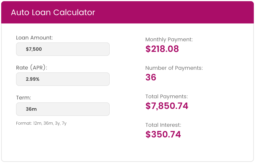
Auto Loan Calculator on hfsfcu.org
3. Visual Eye Candy
Visual eye candy is naturally engaging because sight is arguably the most well-developed human sense. Check out these super sweet websites:
The Bottomline
The bottomline is that interactivity is the future of credit union website design because interactive websites get more engagement and conversions. There are countless ways to make your website more interactive. Just start small, but get started.