If you had to lose one of your senses, which one would you pick? We’re willing to bet it’s probably not your sense of sight. There’s a reason for this. Most humans rely heavily on their sense of sight to get by in this world. Vision claims far more real estate in the human brain than any other sense. About 30% of the neurons in our brain cortex are devoted to sight, compared to 8% for touch and 2% for hearing. That’s why it’s absolutely essential to select fantastic images for your credit union website design. Cheesy stock photos just don’t cut it.
In this post, we’ll show you exactly what makes a great image for your credit union site, using plenty of examples.
#1 Beauty
People don’t trust credit unions with ugly websites. Naturally, your website visitors are much more likely to view your website unfavorably if it’s unattractive or uses poor imagery.
Whether it’s a stunning nature scene or just a moment with the perfect lighting, try to find something beautiful in every single picture you choose. Take a look at this photo we chose for the homepage of a Diamond-Award-winning website, KellyCommunity.org:

The warm, golden light, the rule of thirds, the natural background, and even the color coordinated outfits all create a sense of beauty, while at the same time not looking too posed or overly polished. Notice the image also spans the entire width of the page. If you have a great image, don’t be afraid to make it big. Data suggests that larger images and higher conversions go hand in hand.
#2 Authenticity
Beauty is one thing, but if beauty was all you were going for, why not just show a picture of Hawaii and call it a day? You also need authenticity in your images. Authenticity is incredibly important in the financial industry, because authenticity breeds trust.
Consider this picture, also from KellyCommunity.org:
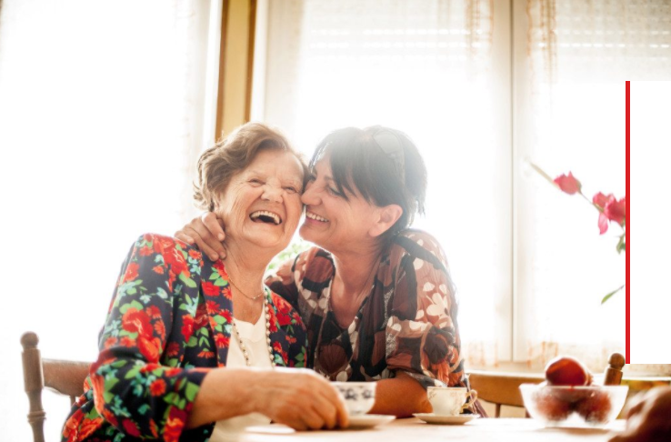
The women in the picture look like real people, not slickly dressed models. They are caught in a candid moment, instead of looking too posed.
Contrast the image above with this image below and the difference shows:

This image isn’t ugly, but it feels posed and inauthentic.
#3 The human element
Even as babies, humans are drawn to faces. We recognize our other human faces, and we’re intrigued by them. Not only do we find other humans intriguing, but pictures with humans also help to create a story around a product or service, a story that your audience can see themselves in.
Take a look at this screenshot from the Auto Loans page we designed for Yolo Federal Credit Union:
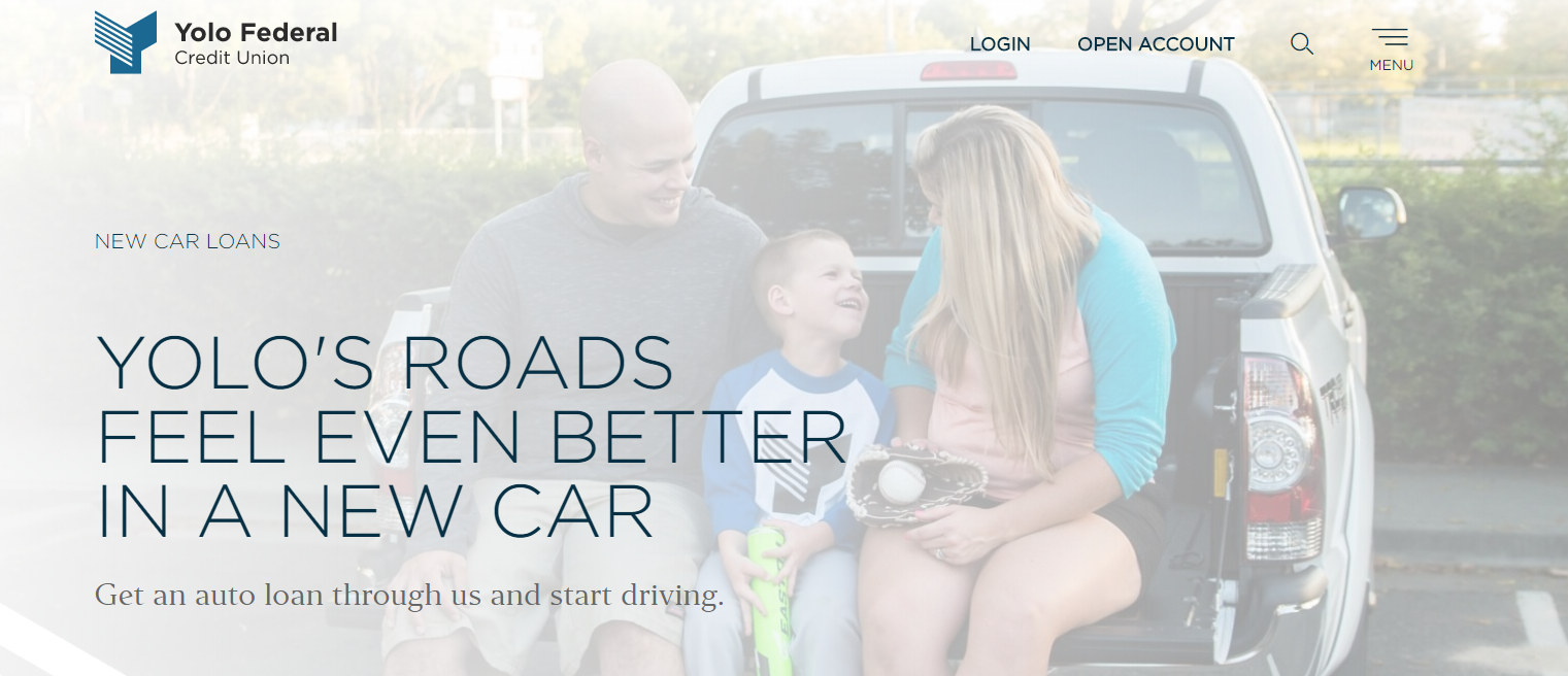
On a typical auto loans page, you might see a photo of a car. However, the picture means so much more when you add the human element. It captures the eye and invokes imagination. Rather than just suggesting, “Here’s how your new car could look,” it instead says, “Here’s what you and your family could experience with a new car.”
Adding a human element to any photo makes it feel more real and immediate. For example, compare the two credit card images below.
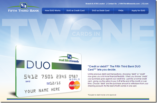
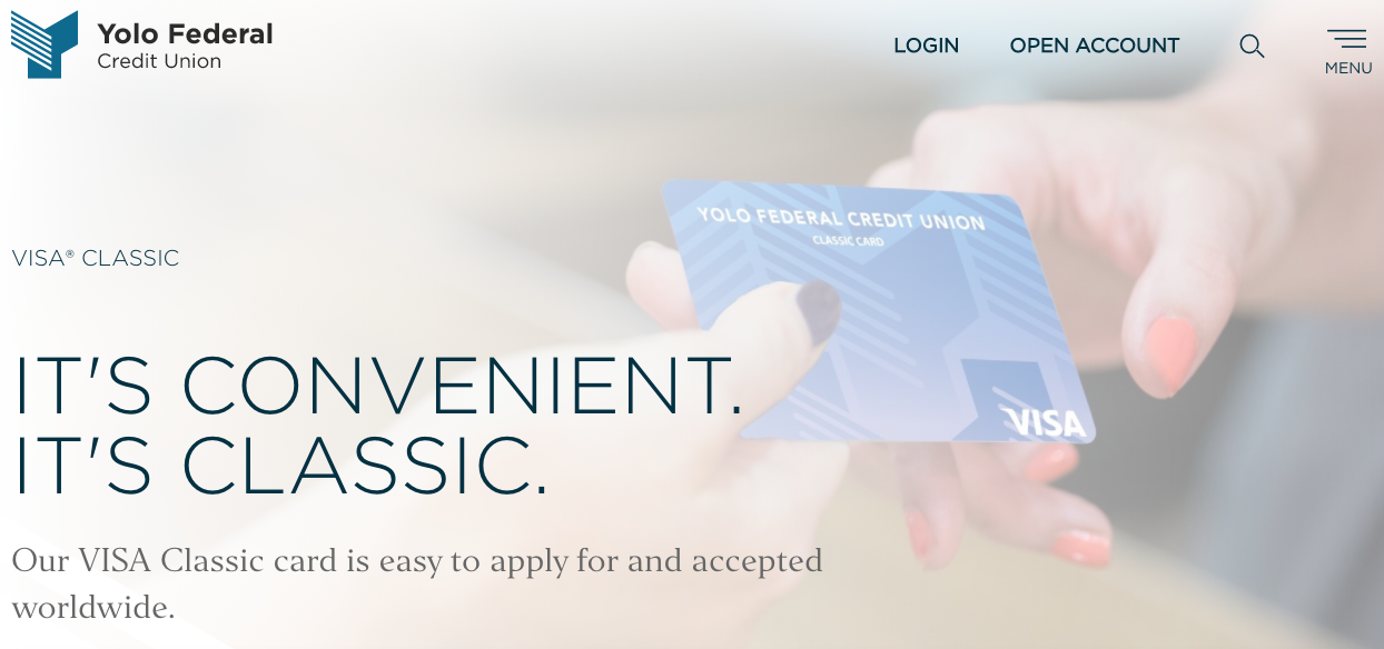
Which image has more power?
Which image has more power? In the picture on YoloFCU.org, we don’t see a face, but even just the hands holding the card lend more relevance to the photo when compared to a floating card all by itself.
#4 Branding
Lastly, you need to make sure the images on your site are true to your brand. Your brand is your greatest asset as a credit union, and your website should show that off. What makes you, and by extension your target audience, unique? What sets you apart? Are you a rural credit union primarily focused on serving farming communities? A credit union that serves a specific industry, like healthcare or construction? Whatever the case, show off your brand on your website by selecting beautiful, authentic, human images that help people understand who you are. Your visitors will see themselves when they land on your page, and they’ll feel right at home.
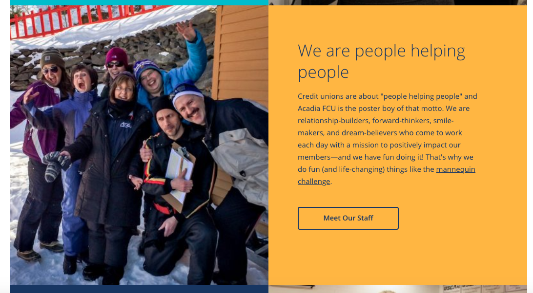
Acadia’s welcoming staff is central to their brand, so their home pages features several staff photos
Good branding is essential for successful websites. In our work as a credit union website design agency, we often go through several rounds of photo suggestions with clients to make sure the final selections truly represents their values and members.