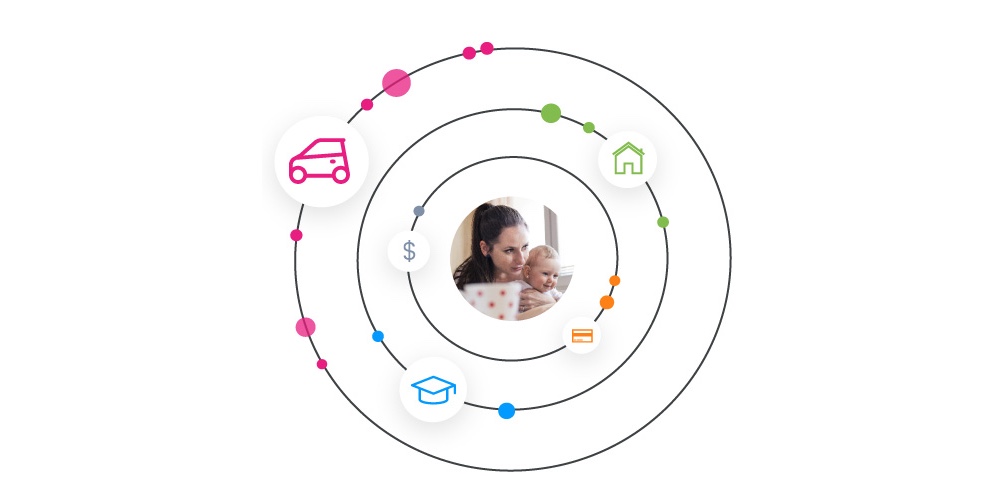
Tone of voice is crucial to a brand’s overall messaging—it tells consumers who you are and what you stand for, and it helps them remember you. Nike is inspiring and motivational. Target is upbeat and peppy. Old Spice is funny and a little absurd. Just as these well-known brands are easily recognizable and loved for their unique values, your credit union website design needs a tone of voice that attracts potential members.
After extensive research with credit union members and non-members across America, the Credit Union National Association and the Creating Awareness Advisory Group compiled insights into a messaging guide to help credit unions craft clear and effective messages. One aspect of their research explored tone of voice, and the guide highlights three values you should communicate to help people understand who you are and your genuine concern for your members.
1. Inspirational
Think about the aspirational goal of your credit union: you help people turn their dreams into reality and make their futures brighter. That powerful purpose should come through loud and clear on your credit union website design so members and potential members understand why they should choose you over other financial institutions. Your tone of voice should help members visualize what they can achieve with your help—this inspiration will create better connections with existing members and pique the interest of potential ones.
To be inspirational, use language that helps consumers picture themselves accomplishing their goals. Use active sentence construction, the present tense, and encouraging statements like “you can.” Also, break up sentences into shorter phrases so they sound more conversational.
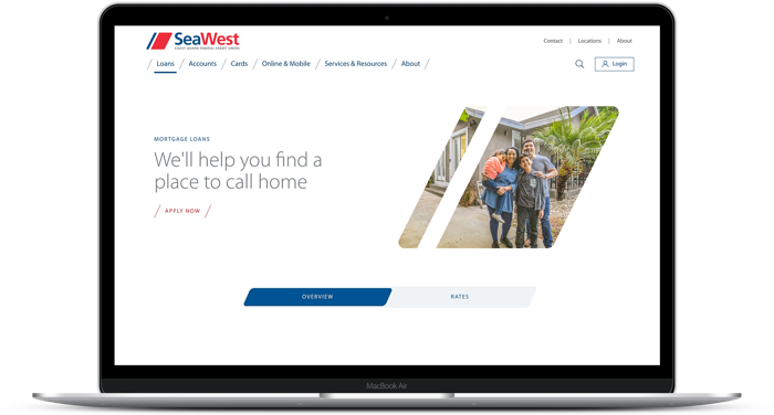
SeaWest.coop’s Mortgage Loans page is a good example of an inspirational tone. It promises, “We’ll help you find a place to call home”—a goal that hits home for many.
2. Down-to-earth
Credit unions are people helping people. Adopting simple, down-to-earth language reassures members that you can actually relate to their needs. If you can relate to their needs, then maybe you know how to help them. It's important that members think of you as a friend or neighbor.
Use inclusive language such as “us” and “we” to convey the idea that you are talking with them, rather than at them. Don’t fall prey to industry jargon—use language that everyone understands, and explain the more technical concepts when necessary. Drive home the importance of your personal connection with members by sharing existing member’s real-life stories.
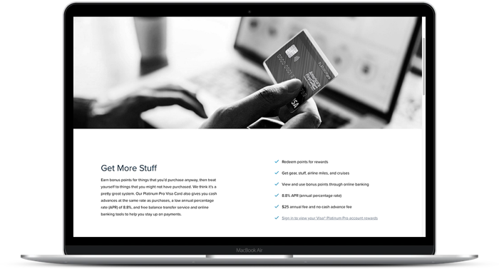
In a down-to-earth way, AmFirst.org’s credit card page says, “Earn bonus points for things that you’d purchase anyway, then treat yourself to things that you might not have purchased. We think it’s a pretty great system.”
3. Modern
Folks want to know that your emphasis on “people helping people” doesn’t mean your technology is ancient. They need to feel confident in your ability to help them reach their financial goals by knowing you use the latest tech to produce the best results.
Discuss your technologies and solutions so they have confidence in your abilities, but do so in a simple and straightforward manner. Clearly convey the benefits they will enjoy from those solutions. Don’t forget to stay consistent with the human element even as you dive into the technical side. And remember that being modern doesn’t mean you have to be serious—you can have fun with the copy on your website.
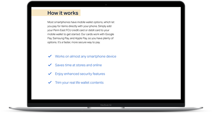
PennEastFCU.org describes their mobile wallet services clearly and concisely so members know exactly what is possible and how to do it.
By defining your tone of voice, you will know who you are and what you stand for as a credit union—and perhaps more importantly, it means your members will know it too.