
The science of color and your brand in 2014
It’s the New Year, and everywhere you look there are articles about what the new trends are for 2014. Green building trends, technology trends, design build trends, branching trends, and so on and so on.
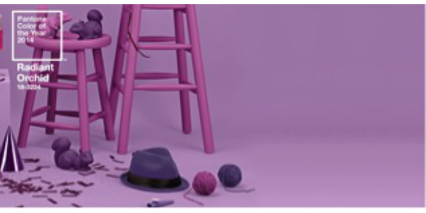
Out of all of the big announcements for 2014, the one that I find most fascinating is Pantone’s “Color of the Year”.
Every year at Momentum, we anxiously await Pantone’s “Color of the Year” to be announced. Well, maybe that’s an exaggeration, but it is definitely of interest to us from a design and color perspective for what’s trending in the New Year.
This year, Pantone has picked a shade of purple, called Radiant Orchid, which is a vast departure from other year’s selections. Last year, it was Emerald, the year before Tangerine Tango, and the year before Honeysuckle (which does not accurately convey deep pink.)
Regardless of how you feel about their color selections, they certainly create a lot of excitement around the announcement and their choice influences many other industries, including beauty, fashion, and interiors. Obviously, we know the affect that color can have on our mood and overall general well-being, but what about the actual science of color?
Apparently, there’s a Pantone Color Institute, who is the “global color authority and provider of professional color standards for the design industries.” Their website further states, “Pantone continues to chart future color direction and study how color influences human thought processes, emotions and physical reactions. Pantone furthers its commitment to providing professionals with a greater understanding of color and to help them utilize color more effectively. “
As a marketing professional, this got my wheels spinning about the influence of color with consumers and the potential positive and negative effects, including brand perception and if there’s actually some science behind color.
Can particular colors create the right branch environment to help support your overall business goals by influencing human thought processes, including decision making?
What comes to mind are branch designs that use more non-traditional color approaches, for example, PNC Bank with the use of bright orange and vibrant blue hues. These are not traditional bank colors and when you see these branches, it clearly conveys that this is not your average bank.
But what other feelings does it evoke? Excitement. Energy. Vitality. Youth. This is definitely not your Grandmother’s bank. But, does it make you more apt to apply for a mortgage?
If you are thinking about re-branding your credit union, what colors will convey the right image? Or evoke the right emotion with your members? How do you want your members to feel when they walk into your branch? And, can you create a branch environment that influences their decision-making process?
Why you may not want to go as extreme as Radiant Orchid, is it time to think about updating your credit union’s colors, branding, and image in 2014?