You can learn how to improve your credit union website design in mere seconds with a Five Second Test. A Five Second Test asks visitors what information they can determine after viewing a page of your website after just five seconds. The user’s goal, in this short frame of time, is to be able to answer these three questions.
- What is the name of the organization?
- What product(s) or service(s) do they offer? (I.e, What kind of organization are they?)
- How can the user benefit from the credit union?
A Five Second Test will tell you if your website is effectively communicating your credit union’s brand, or not. Getting direct input from users can do wonders to help you get more leads for loans and deposits and a Five Second Test is a simple way to get started.
Five seconds might seem like a very short amount of time, but in “website perception time”—which is kind of like doggy years—five seconds is an eon. In fact, Google found that first impressions of a website are formed in as little as 17 ms. Furthermore, according to the Missouri University of Science and Technology, people take just 2.6 seconds to stop scanning a whole webpage and focus on a single element.
How does a Five Second Test work?
In a Five Second Test, users are shown an image of a webpage for five seconds, then the image disappears. Next, the users are asked the three questions mentioned above.
To you, the answers to these questions might seem obvious. For example, you may feel certain your homepage clearly communicates your name, that you’re a credit union, and how members benefit from membership. But can outsiders really determine all that info in just five seconds? You might be surprised by how many credit union website designs fail the test.
Real results from two Five Second Tests
Let’s look at two different website designs and the results they got from Five Second Tests.
ICICI Bank
Take a look at this homepage design from ICICI bank:
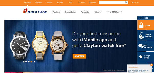
Source: ICICI Bank
We ran an actual Five Second Test on ICICI Banks’s homepage with five users and here are the results:
Question #1: What is the name of the organization?
Responses:
- ICIU
- icic bank
- ICICI
- ?
- Icici
Analysis:
Of the five users, two (40%) got the name of the bank correct, two (40%) more were close, and the fifth (20%) user didn’t know. These results are not good, but could be worse; ICICI is not a very memorable name.
Question #2: What product(s) or service(s) do they offer? What kind of organization are they?
Responses:
- Watches
- Banking and app for it
- They are a bank offering the usual checking/savings accounts.
- Not sure
- Watches
Analysis:
Of the five users, two (40%) correctly identified ICICI as a bank, two (40%) said they sell watches, and the fifth (20%) user didn’t know. These results are poor because most users could not correctly answer the question.
Question #3: How can the user benefit from the organization?
Responses:
- Style
- They give a free watch if you use their app
- They are offering a free watch with a new account
- No idea
- Unsure
Analysis:
Of the five users, two (40%) recognized that you get a free watch if you use one of ICICI Bank’s services, two (40%) didn’t know how they can benefit from ICICI Bank, and the fifth (20%) user said, “Style.”
These results are are complete failure. To start with, most users (60%) couldn’t answer the question correctly. Furthermore, even though two users (40%) recognized that you get a free watch if you use ICICI Bank’s app, is that the most important thing for people to learn about the bank in a first impression? I believe not. I would hope there is a deeper reason for me to borrow or deposit money with ICICI.
ICICI’s design isn’t bad in terms of color or layout, but it’s not immediately clear what they offer and why you should care. If you don’t notice the logo at the top, you might expect them to be a watch store, rather than a financial institution.
OE Federal Credit Union
Now, check out OE Federal Credit Union’s homepage, a website designed by BloomCU:
 Source: OEFCU.org, a website designed by BloomCU
Question #1: What is the name of the organization?
Responses:
- OEFEDERAL CREDIT UNION
- OE Credit Union
- credit union
- CREDITUNION
- OE Federal Credit Union
Analysis:
Of the five users, two (40%) got the name exactly correct, two (40%) just said, “Credit Union,” and the fifth (20%) got the name mostly right but emitted “Federal.” These results mostly good; perhaps “OE Federal” would be even more clear if we changed the headline to, “OE Federal Puts the Union in Credit Union.”
Question #2: What product(s) or service(s) do they offer? What kind of organization are they?
Responses:
- BANK
- Financial products to Union Members
- credit union
- LOANS, THEY ARE A BANK
- Banking
Analysis:
Of the five users, three (60%) said OE Federal is a bank, one (20%) said OE Federal is a credit union, and the fifth (20%) user said they offer financial products to union members. Importantly, 100% correctly identified OE Federal as a financial institution.
Perhaps the word “banks” near the bottom of the screenshot caused most people to identify OE Federal as a bank, but it could also be because the word “bank” is more commonly understood in American vernacular, whereas people are not as familiar with credit unions; in other words, many people might define a credit union as a type of bank.
Question #3: How can the user benefit from the organization?
Responses:
- PROVIDING BANKING OPTIONS
- Specific offerings to help union members
- bank stuff
- GIVING THEM LOANS
- I don't know
Analysis:
Of the five users, two (40%) said OE Federal offers banking services, one (20%) said they give loans, another (20%) said, “Specific offerings to help union members,” and the fifth user (20%) didn’t know. With the exception of the fifth user, these results are good; 80% of users understood, at least in part, the benefit of “banking” with OE Federal.
On which pages should you do Five Second Tests?
First, do a Five Second Test on your homepage. Your homepage gets more visits than any other page of your website and it’s the face of your brand; therefore, it’s the most important place for users to be able to answer those three questions. After testing your homepage, you could move on to some of your popular product pages, such as pages for auto loans, checking accounts, etc.
Who should be your test audience?
Conducting Five Second Tests with your own field of membership is a great idea. However, Useful Usability makes the excellent point that the Five Second Test should not just apply to your specific audience. A credit union website design that’s truly brilliant will be able to pass the Five Second Test with an even wider audience. If you’re looking for an inexpensive and convenient way of recruiting testers, I recommend UserBob—their pricing is the best I’ve seen.
Pro Tip: Research shows you need only five users for an effective user test.
How do you conduct a Five Second Test?
Source: Prototyping and Usability Testing Your Designs, by Elizabeth Snowden
Create a Free Account on UsabilityHub
Usability Hub makes it really easy to conduct Five Second Tests, and it’s free to get started.
Prepare Screenshots
You’ll need a screenshot of your homepage to upload to Usability Hub. You use a screenshot instead of your actual website so you can make certain users stay on the page that’s being reviewed. If you don’t, they might choose to click somewhere else in order to find more information and answer your questions.
Test Your Audience
After each user has viewed your page for five seconds, have them answer the three questions to the best of their ability. UsabilityHub will help you get responses.
Review Your Results
From your UsabilityHub, you can easily view your results. However, you can also export your data to a CSV for further analysis, if needed. If you export to a CSV, put the data in a spreadsheet and grade each answer:
- Correct
- Incorrect
- Partially Correct
Now, start looking at your total results. Were most people able to answer each question correctly? Which questions had the most wrong answers? The data can tell you where your credit union website design needs improvement.
For example, if most people could not recall the name of your credit union, you might want to change the size, colors, or placement of your logo. Or, you might need a new name altogether (e.g., ICICI Bank might be hard to recall no matter what the logo looks like).
If people have trouble determining that you’re a credit union, consider your language and imagery. Is the term “credit union” clearly visible? Do you mention common credit union services? Are the images on your site recognizable or are they confusing?
As you analyze what’s working and what’s broken, you’ll produce an improved design that clearly shows who you are, what you offer, and why people should care. And once you’ve got that in the bag, you’ll likely get higher conversions and a better return on investment, because your website is now clearly communicating the value of your services. Congratulations, you’re a marketing rockstar.