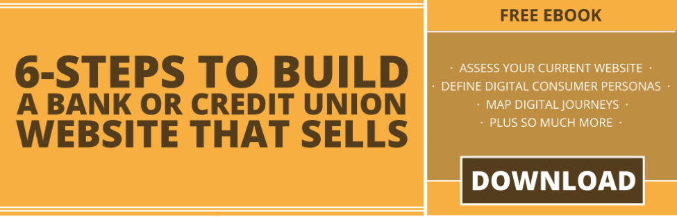
As part of our Financial Digital Marketing Blueprint engagements, we perform an assessment of our clients’ websites based on certain criteria. The primary element of this assessment involves an in-depth review of their current website in which we evaluate various website components, including their homepage, key product pages, website content, calls-to-action, heatmaps, and overall website architecture.
We compile our findings in a report and provide our clients recommendations detailing how they can fix and overcome their current website’s shortcomings.
And while our clients benefit from our recommendations, we find that it is sometimes more compelling for them to hear feedback directly from consumers.
A key component of our website assessment includes performing live user testing of our clients’ current websites. These recorded sessions, in which we have a random sample of users complete various tasks, strip the rose-colored glasses so many of our clients view their current website through and provide an unfiltered perspective for our clients.
With no previous exposure to our clients’ websites, these users in various demographic groups make blunt statements and honest judgments. The sessions are recorded and usually last for 20 minutes, but for the sake of sanity (hearing “um” every three seconds becomes very agitating after a while), we cut these sessions down to five-minute highlight reels for easier viewing consumption.
And the results are typically brutal and squirm-inducing for many of the financial executives in the room.
At the conclusion of our Financial Digital Marketing Blueprint recommendations, we always ask our clients, “What was the most helpful takeaway of today?” Undoubtedly, someone always mentions the live user recordings because of the unbiased insights they bring.
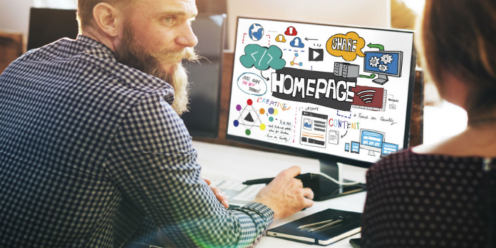
Over the past 18 months, we have observed recurring patterns among the live user tests for the majority of bank and credit union websites. Below is an analysis of bank and credit union website homepages from the perspective of both current members and live user testing.
A Digital Bulletin Board
The most glaring issue we continue to find with credit union homepages is the overabundance of various messages. In fact, I explored this topic in great detail last year.
In short, the average credit union website has nearly 28 different calls to action (CTAs) above the fold on their homepage. That’s like having 28 different doors on the outside of your branches.
There’s a logical explanation for this occurrence, too.
We have found the 80-90% of all of credit union website traffic goes directly into online banking. And to catch the attention of these online banking users, financial institutions use the homepage as a digital bulletin board for any and all announcements for their products and services.
Have a new promotion? Put it on the homepage.
Introducing a new product offering? Cram the announcement next to the rates table.
What about the latest TV spot? Throw it up on the homepage.
And how about that credit union rewards program? Yes, put that mandatory graphic up there as well. After all, it’s just one more thing.
In essence, credit union homepages are used primarily as a communal dumping ground of various, and sometimes random, messages for current customers.
And with the abundance of different messaging and visuals on credit union homepages directed at current customers, new visitors to these websites are subjected to cluttered and bloated homepages.
Is Your Website Professional and Secure?
Because this is the first time users have interacted with our clients’ websites, the first question we ask in our live user testers is, “Do you trust this company?” to assess the user's’ initial thoughts and judgments about the homepages. This question is quickly followed by our second question, “How does this website make you feel?”
While we have user tested numerous credit union websites, the two primary characteristics consumers identified as important when answering the question about trust were the following:
- Professionalism
- Security
Subconsciously, user testers were asking and answering the following questions:
- Does this look like a professional website?
- Do you believe this is a safe and secure website?
If the user testers could answer “Yes” to the above questions, confidence in the credit union website would therefore be established. And that confidence would translate into trust.
What User Testers Have Said
The user testing portion of our Financial Digital Marketing Blueprint engagements is always the unique variable of our delivery.
While we can narrow down the field of potential users based on certain demographics, the inherent variety and scope of the internet ensures a colorful assortment of users will end up testing our clients websites.
And the results are always insightful.
Here’s are a few quotes from a previous user testing sessions that specifically address this idea of trust:
- “This website doesn’t look very professional.”
- “There’re too many colors, and it looks a lot less professional than my current bank’s website.”
- “I don’t feel 100% confident it’s that safest website.”
- “There’s a lock next to the login, which is reassuring.”
- “I don’t see this page and initially think, ‘I’m going to find a loan.’”
- “No, I don’t trust this company. If you’re a reliable company, you’ll have a better website than this.”
- “Do I trust this company? This is something I’m going to look into because of the initial impression of all the colors.”
- “Yes, I sort of trust them, but I will need to research this company a bit more.”
There are numerous variables on a credit union website that can move a consumer one way or another, such as layout, color scheme, font selection, and dozens of other design elements. However, it’s necessary that your credit union begin to address these underlying concepts of professionalism and security for first-time visitors to ensure a memorable digital first impression.
What would live user testing reveal about your homepage?