7 copywriting principles that will seriously improve your credit union website design

Your website is your most important branch. It gets more visitors than any physical location, and it’s where your younger members will most likely go first. That’s why it’s essential that every aspect is in perfect shape. Not only should you have a beautiful, conversion-friendly aesthetic, but you should have good copy as well.
What makes good copy?
For one thing good copy converts. It’s effective at persuading site visitors to fill out loan apps and open accounts.
Good copy should also help build a positive, long-term relationship with your brand. If your copy feels friendly and trustworthy, then the people who read it will get a similar impression of your credit union.
In pursuit of these two noble goals, here’s seven, research-backed tips for writing copy that succeeds.
#1 Make it scannable
On an average webpage, users typically read only 20% of the words. The more wordy you are, the more they will typically skim. It’s essential to be clear and engaging. Don’t write walls of texts or plaster your user with words they don’t understand.
Hot Tip: Use headings, bullets, and subheadings to organize information and make it more scannable. Avoid long paragraphs.
#2 Mind your grammar
While contractions and plain spoken language can be good choices, straight-up typos and spelling errors are a big no. A London research firm found that almost half of the web users were influenced negatively by big spelling or grammar errors. In another instance, TightsPlease misspelled a heading as “Tihgts” on their category page. Once they fixed this error, their conversion rate shot up by 80%.
Hot tip: Make sure at least one hawk-eyed, mistake-catching expert reviews your copy before it goes live. Don’t just rely on spell check—it won’t catch the difference between “our” and “are”.
#3 Make your writing match your brand
Think about what sets your credit union apart. Do you cater to the gritty working man (e.g., OEFCU.org)? Is your membership base the especially-caring type (e.g., LifeCU.org)? Writing to your audience is good marketing 101, but many credit unions forget this on their website, opting for the same bland, generic tone and forgetting what makes them special.
Hot tip: Read every word of copy you write out loud. Try to see if it sounds like something a real person would say, and if that person would be at home with your target audience.
#4 Focus on benefits
People want products that benefit them. When you write to the benefits, you are showing users how your product solves a problem they already have. A benefit is more than just a feature or fact about your product. These are helpful to include, but don’t drive conversions on their own. As the graphic below shows, a feature is how much storage an iPod has, but a benefit is having a 1,000 songs in your pocket.
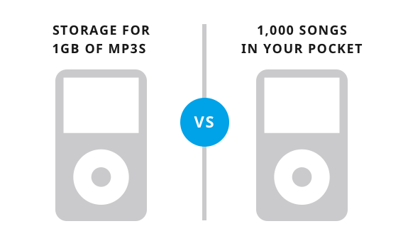
Source: HelpScout
Or for a credit union example:
- Feature: Rates as low as 1.99%
- Benefit: Save hundreds of dollars each year.
Hot Tip: Review each of your webpages and consider what benefits you could focus on, then use features as evidence to support those benefits.
#5 Use power words
Some words convert better than others, and not just in your CTAs. For example, most humans love reading the word “you”. It appeals to our egos. In general, power words are positive, affirmative, inspiring, and consumer-focused. They make people feel energized and engaged, and thus, more likely to take action.
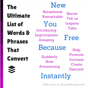
Hot Tip: Check out this list of Power Words from Buffer Social and see which ones might work well with your own brand and credit union website design.
#6 Pay attention to the details
You might put a lot of thought into your taglines and titles, but forget that copy includes literally every word on your site. To provide the best experience possible, you should consider each of your wording decisions. For instance, we recently ran an experiment where we learned that users can find things easier and faster when navigation is noun-based rather than verb-based.
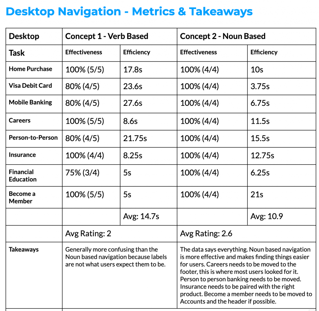
The result? A website that’s much easier to get around, which is very important to users.
Hot Tip: Don’t forget to review and optimize the copy in your menus, footers, alerts, and FAQs. You’ll be surprised what a difference it makes.
#7 Share member success stories
Some of the most powerful copy on your website can be copy you don’t write yourself. Time and again, testimonials have proven to be major conversion boosters across the web. While collecting them may take a little work, they provide key social proof that’s essential for credit unions. In order to compete with the big banks, you need to show potential members you are legitimate and loved.
Hot Tip: You may be sitting on member testimonials that are already written. Do you have some positive reviews on Facebook or Google? Reach out to the happy members and ask their permission to use their review as a testimonial on your site.
Looking for more research-backed tips on credit union website design? Get more insights.