5 essential steps for effective dashboards
by: Peter Keers
In the quest to improve operational performance, credit unions are looking for ways to take advantage of Big Data and Analytics. One area of interest is dashboards.
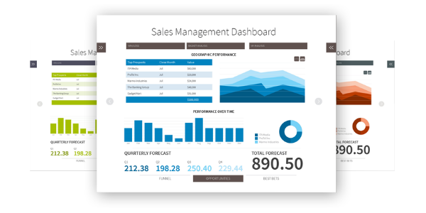
Dashboards are generally defined as easy to use, graphically appealing interfaces showing multiple key performance indicators. Senior managers are often enthusiastic supporters of the dashboard concept since these tools align with the broad scope of C-level responsibilities.
However, dashboard development projects often deliver less than expected benefits. Ironically, complaints vary between “not enough data” and “too much data”. O’Reilly Media just released a great book, Data Driven – Creating a Data Culture, that provides some guidelines for finding the right balance of information to include in dashboards.
- Avoid Data Overload
Too much information can overwhelm users. There is a temptation to include too much in a dashboard. Carefully sorting out the high priority metrics from the “nice to know” variety will make for a less complex but more useable dashboard.
continue reading »