How to guarantee you’ll get a beautiful credit union website design
This guide is for the credit union marketer or executive who wants a beautiful, new website design. Following the principles in this guide will produce a gorgeous credit union website, guaranteed. To see a real-world application of these principles, check out this case study: Credit Union Website Design, A Case Study With Meridia Community Credit Union.
How to Begin
A credit union website design project should always start with discovery. Start by asking questions to understand your current situation and talk about must-haves for your new credit union website. The first question we usually ask is, “What do you like about your current website?” Next we ask, “What do you not like?” Then, “What would you like to see happen?” These simple questions reveal the website’s current situation and hopes for the new website. With careful consideration, answers to these questions will guide the redesign project.
You can also do a User Experience Review of your website. Journey through your website like you’re a user who has a specific purpose. As you journey through your site, think about the user experience. This exercise is helpful to determine what’s good, ok, and ugly about your current website. Those determinations can guide the development of your new credit union website.
This page shows several examples of User Experience Reviews: UX Reviews
4 Principles to Make a Credit Union Website Design Beautiful
Applying the four principles below produces beautiful credit union websites, like this one:
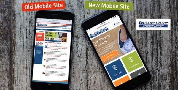
Caption: BoxElderCU.com won a 2016 CUNA Diamond Award for its mobile design.
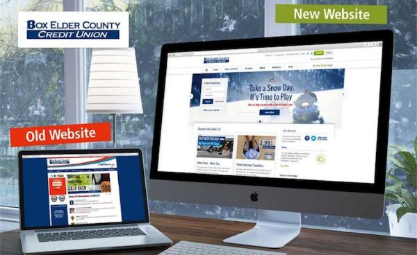
Caption: The design principles in this guide also produced an elegant desktop website for Box Elder.
Later, I’ll show you a couple more gorgeous credit union website designs that were made by applying these principles.
Principle 1: Start with Content, Not Design
Surprisingly, a great credit union website design actually starts with content, not design. A website’s purpose is to persuade action. Content is what you say and design is how you say it. First, outline the content of your website, then use design to communicate your message with simplicity and emotion. If you launch straight into design instead of starting with content, you’re bound to get poor messaging or an ugly website. Therefore, begin the redesign by constructing your website’s navigation and outlining page contents.
Traverse Website Navigation
Finding information on your websites should be easy. Simple website navigation, therefore, is vital to a pleasant user experience. Ask yourselves, “Why do people visit our credit union website? What information do our website visitors need?” List your responses, discuss them, and group them by topic. After grouping the list items, you’ll have a well-organized navigation structure and sitemap. Ta-da!
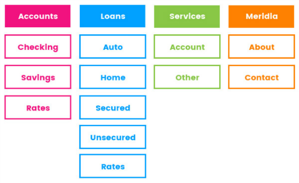
Caption: This a navigation and sitemap example from Credit Union Website Design, A Case Study With Meridia Community Credit Union.
Outline Page Content, Create Page Types
After outlining the navigation and sitemap, you have an inventory of all the pages your website needs. Next, outline the content of each page. Group pages into Types, each Type having a set of unique content elements. For example, all service pages should have the same content elements, while a news page will probably have different elements; therefore, Services and News are different Page Types. Page Types may include Locations, Contact, Rates, Search, News, Products & Services, and the Homepage. Organizing pages into Types creates consistency and simplicity for website users.
Now, outline the content for each Page Type using communication strategies designed to persuade action. For example, all product and service pages should have Position (Branding), Benefit (how people benefit), Evidence, and Call to Action elements.
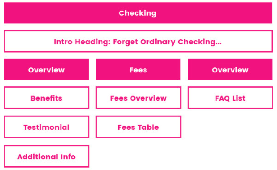
Caption: This a content outline example from Credit Union Website Design, A Case Study With Meridia Community Credit Union.
Principle 2: Discover Design Style and Role Models
With navigation and page outlines complete, it’s time to talk about style guides and role models.
Style Guide
A style guide defines the guidelines of a brand’s colors, fonts, and imagery. We recommend making a style guide before doing a credit union website design project because it will make the design process more effective and efficient. If you don’t have a style guide, get one 🙂 Lots of design agencies can help you create one.
Choosing Role Models
Humans choose roles models to help them make choices. For example, if you want to be an awesome quarterback, then you might imitate Joe Montana. Similarly, Christians imitate Jesus by asking, “What would Jesus do?”
Roles models are also helpful for credit union website design. Look at other organization’s websites–they don’t necessarily have to be credit unions–and find sites you like. Keep a list of what you like and don’t like about websites you see.
Principle 3: Practice Iterative Design
If you’ve followed this guide, you haven’t touched a design tool yet, but now it’s time to go to the whiteboard, open Photoshop (or Illustrator, etc.), and turn imaginations into realities.
Designing gorgeous credit union websites requires collaboration and iteration. Collaborate and iterate during every design step explained below.
Whiteboard Sketches
Start with whiteboard sketches of each Page Type to transform ideas into layout concepts, then discuss and rapidly iterate.
Wireframes
Refine your whiteboard sketches by designing simple wireframes in Illustrator, Photoshop, or a similar software. Wireframes should not include colors, font styles, or images. The purpose of the wireframes is to depict the layout of each Page Type. Collaborate and iterate on the wireframes.
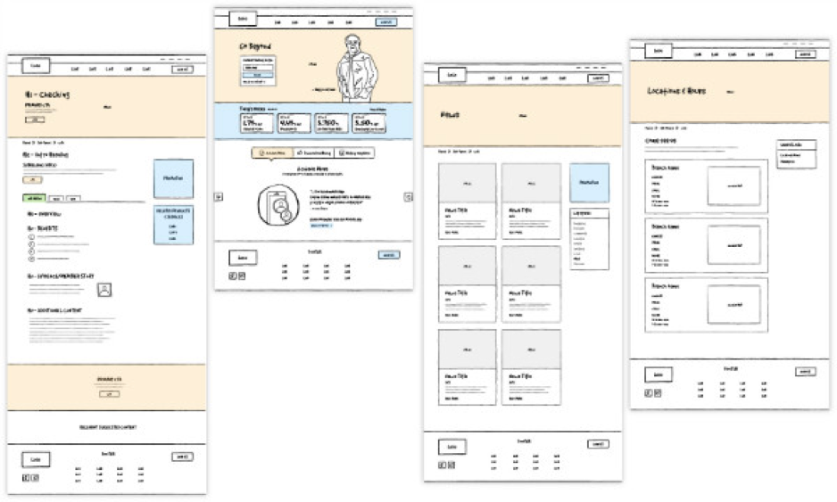
Caption: These are wireframes from Credit Union Website Design, A Case Study With Meridia Community Credit Union.
Designs
After you feel good about the wireframes, use your style guide to apply colors, images, graphics, and font styles to each Page Type. Share the designs with all decision makers to get feedback. Go through several iterations until you love the design. When the designing is done you should feel you’re getting one of the best credit union websites in the world. If you’re not in love with the design, you aren’t done yet.
Prototype
Once all the page types and navigation elements are designed, link all the designs together to make a clickable prototype. A prototype shows how the final website will look and function after launch, which gives everyone a lot of confidence in the designs–or shows where improvements need to be made. (InVision is a great tool for prototyping.)
Do It All Again for Mobile
Make sure you do all of these steps for both the desktop and mobile version of your website. Again, collaborate and iterate until you love the mobile design.
Principle 4: You Gotta Have Design Skills
You could follow all the principles above and still get an ugly website if you don’t have design skills. Design skills are your Hand of Midas. You need a designer who knows how to push buttons in Illustrator and make golden credit union website designs. (I’m not saying this because my company does credit union website design; it’s just the truth.)
The Result: A Beautiful Credit Union Website Design
If you follow the principles explained above, you’ll get beautiful credit union website designs like these:
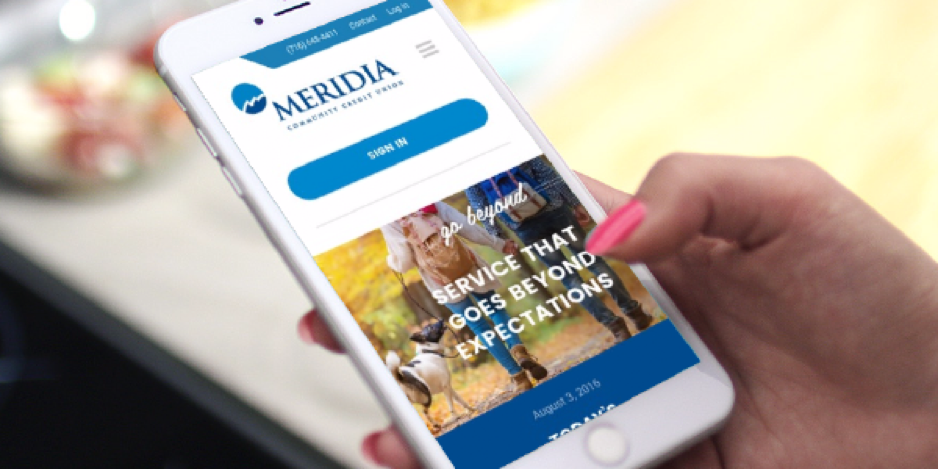
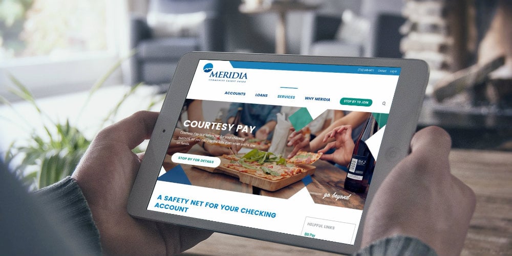
Caption: Launched April 2016, MeridiaCU.com has a great chance of winning a 2017 CUNA Diamond Award.

Caption: Amucu.org shows off an unconventional, beautiful design.
Follow the principles in this guide and you’ll get one of the best credit union websites in the world, guaranteed.