
For Seven Seventeen Credit Union, the data – and listening to members – affirmed that a brand refresh was the right strategy.
As Seven Seventeen Credit Union mapped a strategy for growth – encompassing new markets and a new banking generation – it deliberated whether a new name or brand would better reflect its mission and be a catalyst for growth. Focusing on a strategic approach reliant on data and research, the CU selected Strum Agency (formerly Weber Marketing Group) to manage this name evaluation and brand assessment project and craft a new brand essence.
SITUATION ANALYSIS
Headquartered in Warren, Ohio, Seven Seventeen Credit Union is a $1 billion financial institution with 13 branches, 300 employees and more than 86,000 members spread across six counties. It serves markets in Trumbull, Mahoning, Columbiana, Portage, Summit and Central Stark counties, including the metro areas of Youngstown, Warren, Kent, Ravenna and Canton.
Traditions run deep.
Seven Seventeen CU was founded in 1957 by members of IUE Local 717 at Packard Electric which (through various name changes and ownership structures) currently builds electrical systems for the automotive industry. The union, its members and leaders have enjoyed a strong, long-standing relationship with the CU which continues today. Conservative midwestern origins, combined with a working- class environment, have also fostered relationships between the union, its workers, and the CU since its inception. In fact, the credit union staff itself is unionized.
Financial services are a commoditized product.
The CU’s main product line is financial services, perceived to be a commoditized product by the public, with only minor differences in features and pricing. Market share growth and visibility is reliant upon reputation, branding and staff expertise and all shape the member experience. Delivery channels – including physical branches and financial technologies – also impact the experience. Large com- munity and regional banks are the CU’s primary competition, many similar in asset size and technological capabilities, although national players like Amazon are increasingly rising challenges.
Its value proposition focuses on people, relationships and trust.
A member-driven organization, the CU is dedicated to the communities it serves. Also essential to its value proposition are the employees who deliver diverse financial solutions to members, in a convenient, technology-forward manner. Staff turnover has trended low, with many employees retained 20 years or more. Net member attrition is also low, with the CU losing only 3.3% members annually, (based on a 5-year average). That number is particularly low given the strong population decline in Seven Seventeen’s primary markets, creating unique challenges to future growth. The CU’s long-term strategy for growth focuses on building and enhancing these relationships and special connections.
“We have great respect for our members and work hard to support their financial goals and to advocate for their financial health. In turn, we earn their respect,” explains Eric Lanham, SVP/marketing for the CU. Throughout the process, this principle of mutual respect surfaced as a clear brand differentiator and eventually become a part of the heart of the CU’s brand essence.
SCOPE OF PROJECT
The CU wanted a brand that would showcase its culture and grow with it.
“Crafting a brand is an expensive and resource-intensive process,” says Lanham, “not only in converting marketing materials but the process of communicating and ensuring support from stakeholders. Regardless, we needed to craft a unique image distinct from the competition, create employee passion for living out and delivering our brand, all while delivering a consistent member experience to ensure results.”
The brand team at Strum wondered at the onset if the name, Seven Seventeen, might be problematic. “The credit union was well respected but misunderstood at various levels,” says John Mathes, director of brand strategy for the agency. “The name was long and old-fashioned, and we questioned if it projected an air of exclusivity – that an individual had to work at the plant to become a member.”
A cultural evaluation was the first phase of the brand project, designed to:
- Garner senior management and BOD commitment and alignment
- Measure brand influence and equity
- Obtain feedback from stakeholders
- Help hone the CU’s value proposition and brand promise
Illuminating the need for building a new brand with the CU’s executive team, and why a thorough analysis was necessary, was the first step. “We knew the process would be data-driven,” stresses Lanham. “But it was critical to get the executive team on board first to ensure a smooth and transparent process – and to flesh out any underlying assumptions or misconceptions before we started the discussion with other stakeholders around our name and brand. Change can cause uncertainty and fear, and we wanted to address this right at the beginning.”
Strum reaffirmed the benefits of a strong and inviting brand: in- creased market share and loyalty; leverage to move into new markets; heighten the value of membership; provide clarity of vision; and the ability to expand into new markets and attract new members.
Strum also helped the credit union design a branding committee, 16 individuals representing all departments, marketing, sales, HR, IT, branch operations and senior management. The team’s role was to communicate, incorporate feedback from all levels and help shape a future direction. Lanham notes that “we decided to keep the committee on the larger size, and for us, it was the right choice.”
Measuring brand influence and name equity was the next step.
Research was the driving force behind all aspects of the project, and to understand how individuals perceived the CU, Strum examined five key groups: 1) management, 2) staff, 3) BOD, 4) current members, and 5) potential members in primary and secondary markets.
Research encompassed:
- Discovery and Assessment: A strategic planning review and leadership interviews.
- Quantitative Research: A series of written surveys, including a member and non- member survey and BOD/manager/staff survey.
- Qualitative Research: Member and non-member focus groups discussed brand identity and what appealed by segment; mid-management and staff focus groups brought to light difficulties of the current brand and potential needs.
- Brand Workshop: This day of discovery and vision building featured an organizational cross-section of individuals, with additional brand goals realized and a bold new focus articulated.
“We wanted to determine the perception of the current brand with staff, members and potential members, and the feelings surrounding the Seven Seventeen name,” adds Mathes. Questions related to relevancy and delivery to delve further into the opinions of stakeholders: He notes that 82% of staff, management and BOD participated in the name and brand review process, and their comments reflected the need for a new brand essence and distinction:
“We have no real consistent brand, message or story.” -Staff focus group
“Not having a unique brand makes it impossible to promote who we are.”
-Senior leadership interview
Members and non-members had strong opinions, too.
Asked about the current brand, non-members felt significant confusion; for example, the usage of different logo fonts and bolding of some text and how the word “union” seemed to separate itself. Members felt the logo was non-communicative, non-specific to the business focus of the organization. No one said that the logo was helpful to the organization and the majority felt the logo likely hindered growth.
The data collected guided the comprehensive name and brand assessment prepared by Strum and was presented to the executive team and board of directors prior to the brand refresh. It was also the beginning of the reveal for what would become the CU’s true brand essence.
“The theme of mutual respect shaped, then solidified the new brand promise: Building your financial strength through our common bond.” – John Mathes, Strum
RESPECT: A PRIMARY DECISION FILTER
It is one of the most basic of all human emotions and serves as an individual’s moral compass. Respect also embodies wisdom, esteem and encouragement.
Amidst hours of discussion and review of hundreds of written responses, this concept of respect was not only prevalent but emerged as the strongest common denominator among all stakeholders. “We realized that respect was our eminent core value and a foundation from which we could build,” reflected Lanham. “The vision for our brand and our culture were also one and the same, with mutual respect evolving into a new brand essence; members expressed feelings of esteem while employees shared it was gratifying to work for a respectful organization that treated them well, too.”
How stakeholders viewed respect:
“I am thankful to be a member because they respect me and care for me like family.”
- Member focus group
“Our employees serving our members have the understanding, the rapport, the compassion and the respect to relate to them.”
- Staff survey respondent
“I never realized how important the concept of family, community and caring for each other plays in our day-to- day roles as an organization. We’re all on the same page sharing common goals.”
- Brand workshop participant
It was apparent that the new brand must evolve to showcase and lever- age this differentiation – the CU’s respectful and empathetic approach to service, something the existing brand wasn’t doing effectively.
“While the CU’s reputation was stellar and service impeccable, staff just didn’t have the tools in their arsenal to communicate a brand promise. Nor had it yet been defined,” submits Mathes. “But as the research revealed, we realized a new brand could better articulate the credit union’s mission and take the embodiment of service to the next level.”
OTHER SUPRISING FINDINGS
There were some key brand and name equity findings:
- The CU had an excellent reputation with respect held in the highest regard;
- The Seven Seventeen name was not necessarily a hindrance: it was well-established in the minds of current stakeholders as well as those living in existing and adjacent markets. But it lacked a consistent and clear message for staff to convey and members to embrace.
“We discovered the name was not only recognized and respected but even cherished, evoking a sense of local pride,” says Mathes. “But the big discovery was that members had already acknowledged a cumbersome name and were replacing it with the shorthand: 7 17. We listened, observed and adopted stakeholder reflections, and from a thorough and thoughtful process, the 7 17 brand was manifested and crystallized.”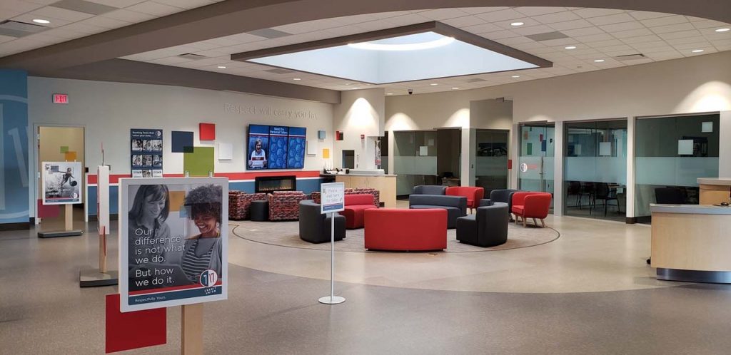
While respect was an epiphany moment, the name evaluation process helped the Board and senior team agree that the research did not justify the need to change names to cultivate its new brand essence. Instead, the CU opted for a modern, more relevant connecting brand, one that would tap into the consciousness and emotional connection of new people and prospect targets. “We wanted to overcome outdated perceptions of the credit union being in a time warp,” offers Mathes, “that it was available only to people who worked at the Delphi Electric Plant.”
Lanham adds everyone was pleased and gratified that the heart of the credit union’s brand identity, its name, didn’t change. “We didn’t need to change who or what we are – just how we articulated and presented our value proposition and brand essence to stakeholders.”
THE RISE OF SIMPLICITY: 7 17
Capturing the essence of a shorter new version of the 7 17 brand, the CU now needed to make an emotional connection to current and potential members as well as stakeholders – and generate brand equity for future growth. Led by the Strum design team, the creative process focused on a new identity package, brand articulation and repositioning strategy, which included:
- Blending all nuances for a cohesive brand story: The CU’s culture steered the brand narrative and connected all the dots for clear and succinct storytelling.
- Designing a new identity package: While not a new name, the package involved a multitude of components, including a new logo, tagline, color palette and brand story.
- Incorporating the short name, 7 17 CU: It was integral in the formation of a new logo and connecting members and prospects to the brand.
- Crafting a tagline that would resonate with stakeholders: Respectfully. Yours. A derivative of the brand essence while reflecting the core value of mutual respect, it became the CU’s “signature” and tagline.
IDENTITY AND MESSAGING
The goal was to create an intimate, more vibrant vision of the brand, framed by a fresh, modern look with consistent messaging to support.
“To articulate the credit union’s mission and values more clearly to its market segments, we focused on the members: what makes them unique; and how they’re part of a larger community that is 7 17 Credit Union and Northeastern Ohio,” explains Jeremy Charbonneau, Senior Graphic Designer for the project.
To represent these ideas, Strum used full color patterned squares to overlay and contrast against black and white photography of individuals. Photos were chosen to project an intimate “camera-roll” feel, capturing real life moments in members’ lives, candid and sincere. Design elements also focused on the subject along with color swatches that harmonized geometrically all blended to create a bigger and more relatable picture.
The typography was chosen to reflect the uniqueness of 7 17 CU members – from the geometric and rounded shape of the fonts to the logo itself – exemplifying elements of the CU. Fonts included Banda Regular for headlines, Myriad Pro for subheads and body copy, and Klavika Regular for callouts. “We intentionally had parts of the typography intertwine for a rugged, yet approachable and friendly feel,” continues Charbonneau. “The fonts reflected the his- tory of the region as well, rooted in hard working manufacturing and electrical engineering.”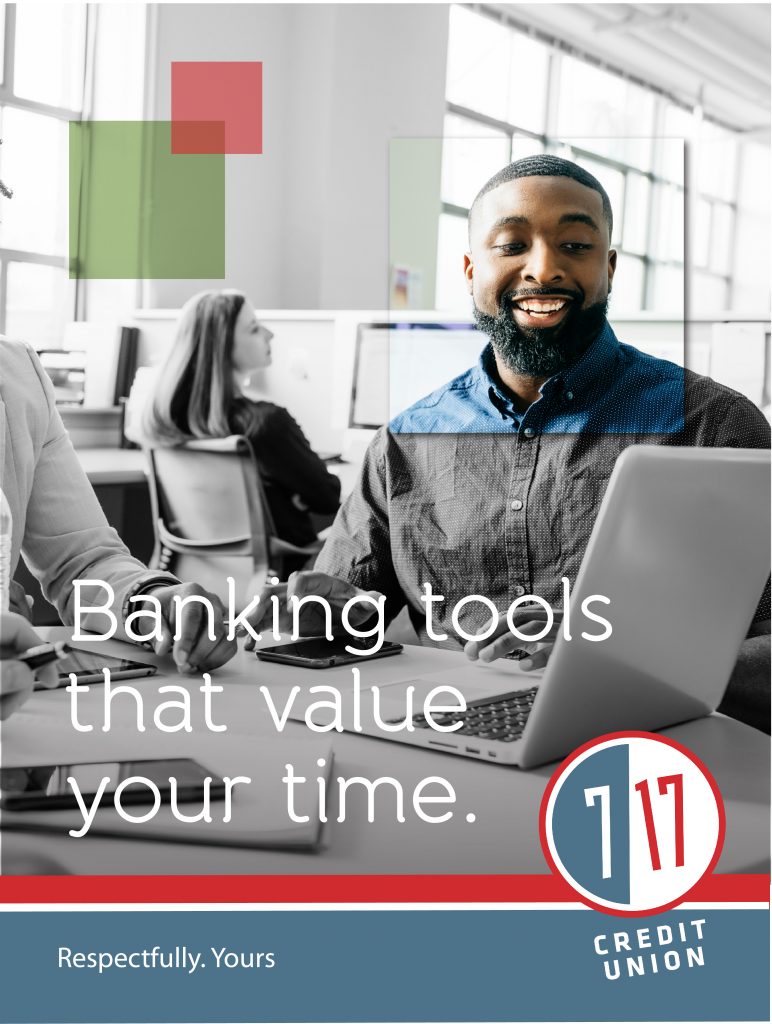
THE BRAND REVEAL
Transparency with stakeholders was integral to success.
Communicating the brand vision at every stage – before, during and after development – was one of the most critical aspects of the process. Following Strum’s best practices, a robust communications schedule was crafted for transparency to staff and members, which included:
- Ongoing team updates on brand development
- The brand reveal for staff and announcement to members
- Continuing (often daily) communication to staff to engrain the brand
- Reiterations to employees and members before the final roll-out
- Final roll-out to members
To introduce employees to the newly minted brand, the CU planned a company-wide evening event, dubbed the “Brand Extravaganza.” The night featured a formal dinner for staff, with the CU’s CEO, board chair and Strum’s Mathes, highlighting facets of the brand and how it evolved, inspiring enthusiasm. “Gifts” were also distributed featuring the new logo, but only of the edible kind (cookies), to ensure the brand would remain confidential until the full member launch.
“Brand Camp” training followed, with Strum brand trainers leading six sessions so all employees could learn how to live the new brand. During the session, staff explored the how, what and why of the brand. “They learned to speak the same language as the brand, with our goal of making everyone a brand ambassador,” notes Mathes. “The sessions enabled staff to fully understand how the new brand delivers on the credit union’s brand promise in consistent actions, behaviors and commitments.”
It takes time to engrain a new brand.
The goal was to ensconce the brand with staff and to point out possible implications for new conversations and opportunities to improve experiences with members. The CU provided consistent brand updates, often daily, so that over time each employee wouldn’t have to think about the new brand anymore; it would simply be second-nature.
Following the brand reveal and up until the formal member launch date, a stream of communication occurred. “We maintained an on- going dialogue with staff until the soft launch to members in January,” explains Lanham. “Member and staff promotion continued for another 90 days, mostly through electronic channels but traditional newsletters, too. The week before the official member launch, staff received daily emails highlighting various facets of the brand.”
-
- October 1 – brand reveal to employees
- January 1 – soft launch to members
- April 1 – the brand is official, offices reflect new branding and signage
“Our website is our largest ‘branch’ and therefore, the largest visualization of our brand.”
– Eric Lanham, SVP/Marketing, 7 17 CU
UNIQUE BRAND EXPERIENCE CHALLENGES AND OPPORTUNITIES
Coinciding with the brand refresh was a complete website redesign.
A responsive web design was an urgent priority, but the project was delayed to link with the brand refresh. “Our website is our largest ‘branch’ and therefore, the largest visualization of our brand,” ex- plains Lanham. “We knew that regardless of whether we changed our name or not, it made sense to wait to launch a new site. This added another and more complicated piece to the brand refresh and new experiences.”
Another vendor handled the website redesign; and while a lot of work, all went smoothly. Lanham believes this was due in large part to the branding guidelines manual prepared by Strum – intended so that any partner can pick it up and deliver on the CU’s look. “We had step-by-step instructions for the vendor to follow,” continues Lanham, “so matching the look of our brand was an incredibly consistent and logical process to follow.”
“Still, rolling out the brand plus a new website required an intense amount of collaboration among multiple departments,” adds Lanham.
“We spent a significant amount of time analyzing and prioritizing what needed changing beforehand and made assignments accordingly. The brand committee was essential to this process.”
IMPORTANT NEXT STEPS
New personas and segmentation opportunities followed the brand refresh.
A chief benefit of crafting a new brand identity can include the insights gained from data analytics. Examining the various audi- ences, Strum determined which segments were providing the most value to the membership – including those maintaining the current book of business and those offering the most potential for lifestyle segmentation strategy and persona development.
Looking at P$YCLE segmentation data, Strum and the CU developed insights around the psychographics that rose to the top, coalescing everything into five personas. Lanham points to a focus on Gen Y and Gen Z, especially for future growth, that led to the honing of the audiences the CU viewed as most important to target. “The development of personas and enhanced segmentation needed to happen alongside the brand refresh,” he says. “And sharpening our lifestyle segmentation strate- gies enabled us to develop more consistent and effective personal messaging to support a new brand promise and engage these newly defined personas.”
RESULTS THAT MATTER TO GROWTH
Historically, the CU has used traditional growth benchmarks in terms of measuring member growth, product penetration and assets, and other KPIs, including the net promoter score (NPS) to assess brand effectiveness. Twelve months before the rebrand, April 2018, the CU’s average NPS score was 72, compared to an industry average of 60.
“We anticipated that our NPS score could decrease following the brand refresh, simply because change can be unsettling for people,” explains Lanham. “To monitor member reaction, we set a goal of not allowing our NPS score to drop below 69 and were pleased to see NPS scores didn’t decrease through the brand refresh. Ten months later, February 2018, it has increased to 73.”
And, Lanham reports that this past year, 2018, has been one of the CU’s most successful years, encompassing strong member and as- set growth as well as an increase in product penetration levels. 7 17 hit a milestone by growing assets to more than $1 billion. Deposits were up 15%. Overall membership grew 5.7%, but more importantly, members between 20 and 44 years of age grew by 8.5%. Related, the 7 17 mobile app usage increased 9%. The Credit Union’s Net Worth, a key measure of safety and strength, increased to 15.2 percent, more than double the seven percent defined as “well-capitalized” under federal law.
AN EXTRAORDINARILY POSITIVE OUTCOME
Lanham advises CUs considering a new name or brand not to assume too much and be open to where the data leads.
“Examine the organization from the top down and bottom up and keep the process data driven. Survey your members or customers, and survey staff at all levels as well as your board of directors. Gather as much empirical data as possible, so your decision is not emotive. And be sure to mine and interpret the wealth of data within your organization to focus your insights.” Also, stay organized.
“During the brand refresh, the marketing team and brand committee worked diligently with each department to develop a comprehensive needs list and to prioritize assignments – what needed to be in place on day one, and all subsequent items ranked accordingly,” Lanham continues. “The information was captured on an excel spreadsheet to ensure no one wondered who was responsible for what.” Finally, select the right partner to assist if you want to achieve real transformation.
“We selected Strum (formerly Weber Marketing Group) because of their expertise with credit union rebranding and belief that data- led processes and strategy can help determine the appropriate outcome.” Our expectations were wholly exceeded, with Lanham adding: “I can’t say enough about Strum’s attention to detail, their understanding of the data and how it relates to the people we serve – and their overall aptitude exhibited throughout the process. Strum helped us to learn more about ourselves and discover new ways to operationalize our brand and share our vision with members. Now Strum is helping us with the retail translation of our brand into new and differentiating experiences where our members can interact with us in exciting new ways.”
7 17 CU didn’t require a new name or to change who it was. Instead, using a research-based, objective analysis, a unique brand essence was uncovered and articulated, making the brand promise relevant for many years to come.