The Year of the Website Makeunder
Only a year ago, just about every bank and credit union website looked a lot like this one from Wells Fargo. Home pages were filled with laundry lists of products and services which were supposed to help users navigate more easily but, instead, the pages felt cluttered and they probably overwhelmed first-time visitors.
I got pretty excited recently when a number of financial institutions radically transformed their websites. Most notably, Chase, Citibank and Bank of America all moved to much simpler designs that now incorporate pointed sales messages that are hard to miss.
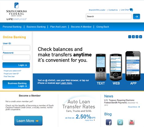
Now other institutions following suit. South Carolina Federal Credit Union (FCU), with With $1.3B in assets, is one such example, as noted in a Credit Union Times article last week. Like the big three, South Carolina FCU’s home page design focuses visitors on a just a few key sales messages. They also use mega menus and a search bar to help visitors find what they need.
continue reading »