
Responsive Web Design
Last month Pete Cashmore, the founder and CEO of Mashable.com, wrote “2013 is the year of responsive web design.” His statement is a powerful endorsement from one of the most powerful voices in technology today, but if you’ve been keeping up with the trends, it probably comes as no surprise. Today “responsive web design” seems to be on the tip of everyone’s tongue. But what is responsive web design, exactly, and how does it apply to credit unions? Is this something credit unions need to start thinking about now, or is it still a novel concept, not mature enough to warrant immediate adoption?
Responsive Web Design, The Basics
The term “responsive web design” was first coined by developer-designer Ethan Marcotte in a May 25th, 2010 article posted on the blog A List Apart. In that article, Marcotte described how developers could use media queries, a new specification of the web development language CSS, to adjust the same website to screen resolutions of different dimensions. Responsive websites are websites that adapt to the size and shape of the viewing environment, be it a Safari on your iPad, a tall and skinny browser window on your PC, or a miniature smartphone screen. Instead of creating a separate mobile site, or forcing users to awkwardly scroll through websites too large for their screens, you can create a single website for all channels. Maintaining separate sites may be feasible for larger institutions, but for smaller institutions who have fewer resources to devote to website maintenance, a responsive website makes a lot of sense.
You can capture the basics in this 6-second Vine of Time.com, which has been responsive since October of 2012:
Yep, it’s really not that complicated. So what’s the big deal?
Responsive Web Design, In Context
In his 2010 article, Marcotte said, “the landscape is shifting, perhaps more quickly than we might like. Mobile browsing is expected to outpace desktop-based access within three to five years. Two of the three dominant video game consoles have web browsers (and one of them is quite excellent). We’re designing for mice and keyboards, for T9 keypads, for handheld game controllers, for touch interfaces. In short, we’re faced with a greater number of devices, input modes, and browsers than ever before.”
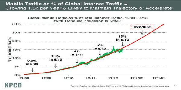
His words were prophetic; at that time smartphones were common, but not yet ubiquitous, and Apple had released the first iPad less than two months before. Not even Marcotte could have predicted the explosion of tablet sales that would take place over the next two years, or the rapid mobile-ization of every industry, from entertainment to e-commerce to retail banking. Today we live in an increasingly diverse landscape of devices. According to the NDP Group, the average household had 5.7 internet enabled devices in Q4 of 2012, and according to Pew, the majority y of Americans use their phones to access the internet and a lot of them actually prefer to use their phones to get online. As devices multiply, building websites that can adapt to different screens makes more and more sense.
Responsive web design is also closely connected to the idea of “mobile first,” which in turn reflects the across the board drive towards simplicity in web design that has been building over the last few years. You can see the trend toward simplicity in the website redesigns of financial institutions, from megabanks like Chase and Citi and small credit unions like Vibe and People’s (none of which are yet responsive). Both responsive and the mobile first approach force you to prioritize, by asking the question, “If you had to squeeze your website down to an itty-bitty screen, what would be left?” Chances are, those items are most important, and should be dominant at every level. It’s a fantastic way to get organizations to make tough choices to simplify their websites.
Responsive Web Design, For Credit Unions
In November of 2012, the Financial Brand published an article called “Responsive Web Design for Financial Institutions: Fad or Strategy.” The article listed a number of financial institutions that have launched responsive websites, including Army Aviation Center Federal Credit Union, Countryside FCU, and SB1 Federal Credit Union. These institutions clearly see the benefit of a responsive website, but is responsive web design right f or every institution?
If your institution takes the need for a mobile strategy as a given (which it should), responsive web design becomes another factor to consider in the mobile app vs. mobile web debate. The biggest downside to a mobile app is that you need to download it, and the biggest downside to mobile web is user experience: zoom in, zoom out, scroll left, scroll right, backtrack and navigate your finger clicked the wrong tiny text link. Responsive web design done right makes that type of experience a thing of the past. And whereas a mobile site or a mobile skin will only solve the user experience problem for a predetermined subset of screens, responsive web design is infinitely adaptable to devices that exist now, and theoretically, to devices that will exist in the future.
For returning members, downloading a dedicated mobile banking app may still make more sense, but as more and more consumers are shopping for retail products and for financial institutions on their mobile devices, downloading makes less sense, and mobile web is becoming increasingly important.
Responsive web design is NOT a new channel; it’s a new approach to a multichannel strategy. A responsive website means that consumers can access the same content on your site from any portal, large or small, stationary or mobile. A bet on responsive web design is a bet that our devices will continue to vary in shape, and that in the future consumers will want to research new financial institutions and buy financial products from anywhere, at any time, from anything. What bet does your credit union want to make? If you want to learn more about responsive design, Andera is hosting a webinar on our application of responsive design on July 10th.