How a website can help your credit union grow, delight, and cut costs

Building a new credit union website design isn’t something you can place on your list of aggressive quarterly goals and check off a few weeks later. Instead of a redesign fling once every few years, it should be a long-term initiative undergoing continuous improvement. It’s a marathon, not a sprint.
So how do you successfully run the website redesign marathon? You adopt growth-driven design (GDD) as your training strategy. GDD is a proven method to grow your credit union through continuous, results-driven improvements, rather than one big project every three years. The more you train, the faster you run. The more you iterate, the closer your website gets to its ideal state.
As you train for a marathon, you might be working towards a new personal record. You plan your training around this objective, making consistent and ongoing efforts to reach it. When designing a website, you need your goal to be just as clear in order to guide your continuous improvement efforts—you need to understand your final destination so you can figure out how to get there.
Setting a goal is the first step of growth-driven web design, and it’s also arguably the most important. So take the time to decide what you want your website to achieve for your credit union. As I’ve talked to over 200 credit unions, I’ve found that they all have three goals in common: Grow, Delight, and Cut Costs.
Grow
Grow your credit union by getting more applications for membership, accounts, and loans.
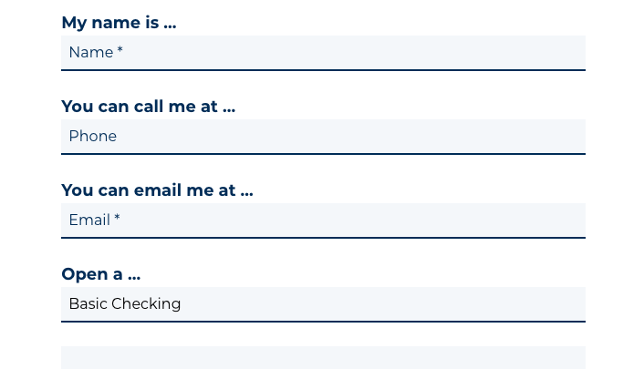
- Increase account and loan applications: In order to grow deposits and loans, you need to draw visitors in as soon as they land on your site. Focus your website iterations on capturing visitors’ interest, clearly communicating your value, and providing effective educational resources to guide their financial decisions. Once you have their attention, make it simple for them to start an application. Optimize your forms to increase submissions.
 Delight
Delight your members by giving them simple, beautiful experiences that save them time and money.
- Increase usability: Too often, credit unions receive complaints about their websites because they provide poor user experiences, perhaps because the site is too hard to navigate or provides a difficult login flow. Try making simple changes to increase usability, such as improving site navigation to ensure visitors can find what they’re looking for right away and thus increase efficiency. Through usability testing, you can measure the effectiveness and efficiency of your website:
- Effectiveness is the rate at which people successfully complete a task (e.g., “99% of our members can successfully log in to online banking”).
- Efficiency is the amount of time it takes for someone to complete a task (e.g., “Our average member can log in to online banking in 3.5 seconds”).
(To start usability testing, get this Usability Testing Worksheet.)
- Increase positive feedback: Iterate and then iterate some more in order to make a visit to your website as enjoyable as possible. For example, we know members highly value convenience and prefer self-serving technologies. Make it easy for them to complete services such as online banking and bill pay. By creating pleasant experiences for your members, you can increase your credit union’s Net Promoter Score.
Cut Costs
Cut costs for your credit union by answering FAQs and streamlining processes.
- Save time: Let your website take over some of the heavy lifting so you can allocate your time to the most important activities. For example, let’s say you spend lots of time updating rates on your website. If a new feature could make it easier to update rates, that would give you more time to work on a marketing campaign or watch cat videos on YouTube (whatever strikes your fancy).
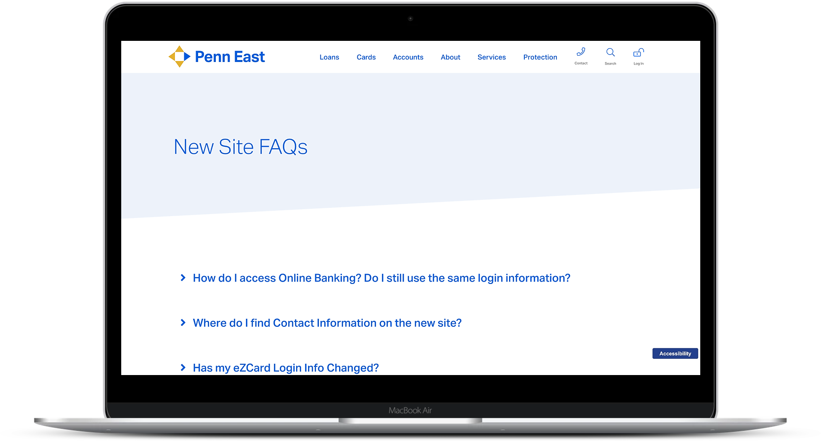
- Save money: Think about ways you can make small improvements that can result in big payoffs. For example, you can reduce call center costs simply by including a clear and thorough FAQ section on your website that answers questions so your call center agents don’t have to keep repeating your routing number.
Once you’ve decided on your credit union website design’s goal, you can start mapping out the improvements you need to get there, implement those changes, and measure your results.
Here are a few examples of credit union marketers that have set goals and used their websites to achieve them:
Katelyn McManamon, Penn East FCU
Goal: Grow by getting more membership applications
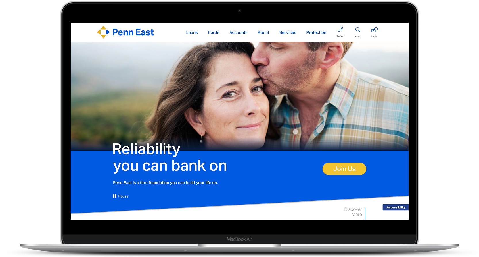
My company, BloomCU, helped Katelyn McManamon, AVP of Marketing at Penn East FCU, design a new website that increased their leads for membership by 4,200%.
Dave Sullivan, People Driven CU
Goal: Grow by getting more loan applications
BloomCU helped Dave Sullivan, VP of Marketing at People Driven CU, set up a simpler web form and increase leads for auto loans by 413%.

Ashley Yamamoto, HFSFCU
Goal: Grow by getting more loan applications
BloomCU also helped Ashley Yamamoto, Marketing Coordinator at HFSFCU, use personalization technology to increase application starts by 31%.
